CSS3 生态体系
重要通知
CSS(Cascading Style Sheets),即层叠样式表,使用CSS,不仅可以实现优雅友好的网页布局,更能实现强大的视觉体验效果。
CSS基本概况
- 层叠样式表: https://developer.mozilla.org/zh-CN/docs/Web/CSS
- 菜鸟教程:https://www.runoob.com/css3/css3-tutorial.html
- CSS 参考手册:https://www.runoob.com/cssref/css-reference.html
- CSS 选择器:https://www.runoob.com/cssref/css-selectors.html
- css-tricks:https://css-tricks.com/
- CSS属性大全:https://www.runoob.com/cssref/css-reference.html
案例参考
- 网格布局:https://developer.mozilla.org/zh-CN/docs/Web/CSS/CSS_Grid_Layout
- 解决常见的 css 问题:https://developer.mozilla.org/zh-CN/docs/Learn/CSS/Howto
- 每个 CSS 属性关于重排、重绘、合成与绘制的成本:https://csstriggers.com/
- CSS如何实现弹簧动画效果:https://www.w3cplus.com/animation/spring-animation-in-css.html
- CSS骰子翻转动画:https://blog.51cto.com/dana/5611267
- 3D旋转+SVG路径动画:https://www.jq22.com/yanshi24205
- jQuery 3d轮播图:https://www.jq22.com/yanshi24031
物理像素与CSS像素
CSS 像素和设备像素。单个 CSS 像素可以直接对应于单个设备像素,也可以由多个设备像素支持。重点是什么?嗯,设备像素越多,屏幕上显示内容的细节就越精细。
物理像素:即设备像素,他是屏幕的物理单位。
css像素:即逻辑像素,在css和javascript中使用的一个抽象的层,每一个css声明和几乎所有的javascript属性都使用css像素。
px,pt,em换算表:https://www.runoob.com/w3cnote/px-pt-em-convert-table.html
Px、Em 换算工具:https://www.runoob.com/tags/ref-pxtoemconversion.html
px、em、rem区别介绍:https://www.runoob.com/w3cnote/px-em-rem-different.html
pt (point,磅)
pt (point,磅):是一个物理长度单位,指的是72分之一英寸。
px (pixel,像素)
px (pixel,像素):是一个虚拟长度单位,是计算机系统的数字化图像长度单位,如果px要换算成物理长度,需要指定精度DPI(Dots Per Inch,每英寸像素数),在扫描打印时一般都有DPI可选。Windows系统默认是96dpi,Apple系统默认是72dpi。
em(相对长度单位,相对于当前对象内文本的字体尺寸)
em(相对长度单位,相对于当前对象内文本的字体尺寸,相对于父级元素的字体大小):是一个相对长度单位,最初是指字母M的宽度,故名em。现指的是字符宽度的倍数,用法类似百分比,如:0.8em, 1.2em,2em等。
window.devicePixelRatio
返回当前显示设备的物理像素分辨率与CSS像素分辨率之比,告诉浏览器应使用多少屏幕实际像素来绘制单个CSS像素。
- https://developer.mozilla.org/zh-CN/docs/Web/API/Window/devicePixelRatio
- 功能:返回当前显示设备的物理像素分辨率与CSS像素分辨率之比。
- 告诉浏览器应使用多少屏幕实际像素来绘制单个CSS像素。
const ratio = window.devicePixelRatio;
值与单位
CSS 中使用的每个属性都允许拥有一个或一组值。
- 百分比:%
- rem:设置相对于根元素
<html>的字体大小; - vw(视窗宽度的百分比): 相对于视窗的宽度。
- vh(视窗高度的百分比): 相对于视窗的高度,指CSS中相对长度单位,表示相对视口高度(Viewport Height),1vh = 1% * 视口高度。
- vmin 相对于视口的宽度或高度中较小的那个被均分为100单位的vmin
- vmax 相对于视口的宽度或高度中较大的那个被均分为100单位的vmax
- DPI:DPI(Dots Per Inch,每英寸点数)是一个量度单位,用于点阵数码影像,指每一英寸长度中,取样、可显示或输出点的数目。
相关换算机制
pt = 1/72(英寸), px = 1/dpi(英寸) | pt = px * dpi / 72
| 数值类型 | 描述 |
|---|---|
<integer> | <integer>是一个整数,比如 1024 或 -55。 |
<number> | <number>表示一个小数——它可能有小数点后面的部分,也可能没有,例如 0.255、128 或 -1.2。 |
<dimension> | <dimension>是一个<number>,它有一个附加的单位,例如 45deg、5s 或 10px。<dimension>是一个伞形类别,包括<length>、<angle>、<time>和<resolution>类型。 |
<percentage> | <percentage>表示一些其他值的一部分,例如 50%。百分比值总是相对于另一个量,例如,一个元素的长度相对于其父元素的长度。 |
相对长度单位
| 单位 | 相对于 |
|---|---|
em | 在 font-size 中使用是相对于父元素的字体大小,在其他属性中使用是相对于自身的字体大小,如 width |
ex | 字符“x”的高度 |
ch | 数字“0”的宽度 |
rem | 根元素的字体大小 |
lh | 元素的 line-height |
vw | 视窗宽度的 1% |
vh | 视窗高度的 1% |
vmin | 视窗较小尺寸的 1% |
vmax | 视图大尺寸的 1% |
绝对长度单位
| 单位 | 名称 | 等价换算 |
|---|---|---|
cm | 厘米 | 1cm = 96px/2.54 |
mm | 毫米 | 1mm = 1/10th of 1cm |
Q | 四分之一毫米 | 1Q = 1/40th of 1cm |
in | 英寸 | 1in = 2.54cm = 96px |
pc | 十二点活字 | 1pc = 1/6th of 1in |
pt | 点 | 1pt = 1/72th of 1in |
px | 像素 | 1px = 1/96th of 1in |
百分比
- 如果将元素的字体大小设置为百分比,那么它将是元素父元素字体大小的百分比。
- 如果使用百分比作为宽度值,那么它将是父值宽度的百分比。
颜色体系
颜色格式转换
- RGB颜色值与十六进制颜色码转换工具: https://www.sioe.cn/yingyong/yanse-rgb-16/
- 颜色值转换: https://sunpma.com/other/rgb/
不同颜色格式值
Element {
  /** 普通值 */
  background-color: #02798b;

  /** RGB值 */
  background-color: rgb(2, 121, 139);

  /** RGBA值 */
  background-color: rgb(197, 93, 161);

  /** HSL值:色调、饱和度、亮度 */
  background-color: hsl(188, 97%, 28%);

  /** HSLA值 */
  background-color: hsla(188, 97%, 28%, .3);
}
常用颜色值
Element {
  /* 白色 */
  color: rgba(255, 255, 255, 1);

  /* 灰色 */
  color: rgba(220, 223, 230, 1);

  /* 黑色 */
  color: rgba(0, 0, 0, 1);

  /* 蓝色 */
  color: rgba(64, 158, 255, 1);

  /* 提示色 */
  color: rgba(184, 130, 48, 1);
}
函数
calc()函数
- calc() 函数用于动态计算长度值。
- 运算符前后都需要保留一个空格,例如:width: calc(100% - 10px);
- calc()函数支持 "+", "-", "*", "/" 运算
- calc()函数使用标准的数学运算优先级规则;
Element {
  width: calc(100% - 100px);
  width: calc(100% - 100em);
  width: calc(100px / 2);


  width: calc(100vw * (1260 / 1920));
  width: calc(100vw * (20 / 375));


  /** 百分之比 */
  padding-top: calc(100% * (378 / 260));
}
<style type="text/css">
  .calc-frame {
    position: relative;
    background-color: rgba(0, 0, 0, 0.05);
  }
  .calc-frame > div {
    position: relative;
  }
  .test-01 {
    width: calc(100% - 100px);
    background-color: rgba(0, 0, 0, 0.1);
  }
  .test-02 {
    width: calc(100% / 2);
    background-color: rgba(0, 0, 0, 0.2);
  }
  .test-03 {
    width: calc(100% - 100px / 2);
    background-color: rgba(0, 0, 0, 0.3);
  }
  .test-04 {
    width: calc((100% - 100px) / 2);
    background-color: rgba(0, 0, 0, 0.4);
  }
  .test-05 {
    width: calc(100% - 100px * 2);
    background-color: rgba(0, 0, 0, 0.5);
  }
</style>

<section class="calc-frame">
  <div class="test-01">01</div>
  <div class="test-02">02</div>
  <div class="test-03">03</div>
  <div class="test-04">04</div>
  <div class="test-05">05</div>
</section>
var()函数
var() 函数用于插入自定义属性的值,而不是另一个属性的值的任何部分。
:root {
  --main-bg-color: coral;
}

Element {
  background-color: var(--main-bg-color);
}
其他函数
Element {
  background-image: url('url');
  background-color: rgb(2, 121, 139);
  background-color: rgb(197, 93, 161);
  background-color: hsl(188, 97%, 28%);
  background-color: hsla(188, 97%, 28%, .3);
}
函数列表
- attr():返回选择元素的属性值。
- calc():允许计算 CSS 的属性值,比如动态计算长度值。
- cubic-bezier():定义了一个贝塞尔曲线(Cubic Bezier)。
- conic-gradient():定义了一个圆锥渐变。
- counter():设置计数器。
- hsl():使用色相、饱和度、亮度来定义颜色。
- hsla():使用色相、饱和度、亮度、透明度来定义颜色。
- linear-gradient():创建一个线性渐变的图像
- max():从一个逗号分隔的表达式列表中选择最大的值作为属性的值。
- min():从一个逗号分隔的表达式列表中选择最小的值作为属性的值。
- radial-gradient():用径向渐变创建图像。
- repeating-linear-gradient():用重复的线性渐变创建图像。
- repeating-radial-gradient():类似 radial-gradient(),用重复的径向渐变创建图像。
- repeating-conic-gradient():重复的圆锥渐变。
- rgb():使用红(R)、绿(G)、蓝(B)三个颜色的叠加来生成各式各样的颜色。
- rgba():使用红(R)、绿(G)、蓝(B)、透明度(A)的叠加来生成各式各样的颜色。
- var():用于插入自定义的属性值。
特殊样式声明
/* 全局变量 */
:root {
  --main-color: hotpink;
  --pane-padding: 5px 42px;
}
/* 引用语法 */
Element {
  padding: var(--pane-padding);
}

Element {
  /*https://developer.mozilla.org/zh-CN/docs/Web/CSS/user-select*/

     /*控制用户能否选中文本*/
     user-select: none;  /*auto | text | none | contain | all*/
-moz-user-select: none;


  /**
   * 优化滚动机制
   * scroll-snap-type: none | [ x | y | block | inline | both ] [ mandatory | proximity ]
   * scroll-snap-align: start | center | end;
   */
  scroll-snap-type: x mandatory;
  scroll-snap-align: center;
}

Element {
  font-synthesis: none;
  -webkit-font-kerning: none;
  font-kerning: none;
  -webkit-font-variant-ligatures: none;
  font-variant-ligatures: none;
  -webkit-font-feature-settings: "kern" 0,"calt" 0,"liga" 0,"clig" 0,"dlig" 0,"hlig" 0;
  font-feature-settings: "kern" 0,"calt" 0,"liga" 0,"clig" 0,"dlig" 0,"hlig" 0;
  font-family: unset;
  -webkit-font-smoothing: subpixel-antialiased;
}
clip 属性剪裁绝对定位元素
Element {
  clip: rect (top, right, bottom, left);
}
clip-path
舞台聚光灯效果。
/** 多边形 */
clip-path: polygon(0 100%, 50% 0, 100% 100%);

/** 梯形 */
clip-path: polygon(100% 0,75% 100%, 25% 100%, 0 0);

/** 圆形 | (半径 at 坐标X 坐标Y) */
clip-path: circle(50% at 50% 50%);

/** 椭圆 | 椭圆的x轴半径、y轴半径以及椭圆圆心(x y) */
clip-path: ellipse(30% 20% at 50% 50%);

/** 四方形 | 裁切一个圆角 inset(<top> <right> <bottom> <left> round <top-radius> <right-radius><bottom-radius> <left-radius>) */
CSS 属性排序
默认重置样式
/*
 * CSS在各个浏览器的初始值不一致,为了实现兼容性问题,对CSS进行初始化
 **/
@charset "utf-8";

* {
  -webkit-tap-highlight-color: rgba(0, 0, 0, 0);
}

*:not(.filter-box) {
  -webkit-box-sizing: border-box;
  box-sizing: border-box;
}

html {
  height: 100%;
}

body {
  min-height: 100%;
}

body {
  margin: 0;
  /*margin: 8px;*/
}

dl {
  margin-top: 0;
  /*margin-block-start: 1em;*/
  margin-bottom: 0;
  /*margin-block-end: 1em;*/
}

dd {
  margin-left: 0;
  /*margin-inline-start: 40px;*/
}

p,
h1,
h2,
h3,
h4,
h5,
h6 {
  margin-top: 0;
  /*margin-block-start: 1em;*/
  margin-bottom: 0;
  /*margin-block-end: 1em;*/
}

pre,
code {
  font-family: cursive, fangsong;
}

table {
  border-spacing: 0;
  /*border-spacing: 2px;*/
  border-collapse: collapse;
  /*border-collapse: separate;*/
  empty-cells: show;
}

table > thead > tr > td,
table > tbody > tr > td,
table > tr > td {
  padding-top: 0;
  padding-bottom: 0;
}

ul,
ol {
  list-style-type: none;
  /*list-style-type: disc;*/
  margin-top: 0;
  /*margin-block-start: 1em;*/
  margin-bottom: 0;
  /*margin-block-end: 1em;*/
  padding-left: 0;
  /*padding-inline-start: 40px;*/
}

menu {
  margin-top: 0;
  /*margin-block-start: 1em;*/
  margin-bottom: 0;
  /*margin-block-end: 1em;*/
  padding-left: 0;
}
CSS样式规范与命名规范
- 除了公共类名,所有类名必选进行作用域限制
<style type="text/css">

.page-xxx {}

/** .aux-xxx 辅助类名不能单独使用,必须与主类名一起使用 */
.page-xxx.aux-mobile {}


/** 仅仅 */
.aux-only-xxx {}

/** 排除 */
.aux-exclude- {}

/** 包括 */
.aux-include- {}

</style>


<!--页面:功能名称-->
<div class="page-xxx  aux-mobile">

  <!--布局:功能名称-->
  <section class="layout-xxx">

    <!--包裹:功能名称-->
    <div class="wrapper-xxx">

      <!--内容:语义化标签-->
      <h2>标题</h2>
      <p>描述</p>
    </div>

  </section>

</div>
多端网页适配方案
移动网页适配方案,即根据不同终端设备灵活适配的相关网页技术。
流式布局
em布局
根元素REM方案
相对于HTML根元素字体大小的相对尺寸。
- 如果设计稿的宽度基准是750px,则网页中的尺寸1rem也就是设计稿中的100px。
(function(global) {
  'use strict';

  // 限制最大宽度为980,尤其是PC端宽度
  const maxWidth = 980;
  const initWidth = 750;

  function scale(desW, fontSize) {
    const width = window.innerWidth || document.documentElement.clientWidth || document.body.clientWidth;
    const w = width > maxWidth ? maxWidth : width;
    const ft = w / (desW / fontSize);
    document.documentElement.style.fontSize = ft + "px";
  }

  scale(initWidth, 100);
  window.onresize = function() {
    scale(initWidth, 100);
  }
})(this);
REM 响应式缩放页面
// 注意:iOS10以后版本不接受meta标签,可以通过js监听手势控制来实现禁止页面缩放
document.addEventListener('gesturestart', function (event) {
  event.preventDefault()
});

(function (global) {
  'use strict';

  // 判断是否为PC端
  const ua = navigator.userAgent.toLowerCase();
  const isPC = !ua.match(/AppleWebKit.*Mobile.*/i);

  const maxWidth = isPC ? 420 : 980;
  const initWidth = 750;

  function scale(desW, fontSize) {
    const width = window.innerWidth || document.documentElement.clientWidth || document.body.clientWidth;
    const w = width > maxWidth ? maxWidth : width;
    const ft = w / (desW / fontSize);
    document.documentElement.style.fontSize = ft + "px";
  }

  scale(initWidth, 100);
  window.onresize = function () {
    scale(initWidth, 100);
  }
})(this);
PC端与移动端
<style type="text/css">
body {
  &:not([puppeteer="screenshot"]):not([platform="pc"]) {
    .app-container {
      max-width: 980px;
    }
  }

  &:not([puppeteer="screenshot"])[platform="pc"] {
    .app-container {
      max-width: 420px;
    }
  }

  &[puppeteer="screenshot"] {
    width: 750px;
  }
}
</style>

<script type="text/javascript">
  // 判断是否为PC端
  const ua = navigator.userAgent.toLowerCase();
  const isPC = !ua.match(/AppleWebKit.*Mobile.*/i);

  document.body.setAttribute('platform', isPC ? 'pc' : 'mobile');

  const puppeteer = localStorage.getItem('puppeteer');
  if (puppeteer) {
    document.body.setAttribute('puppeteer', 'screenshot');
  }
</script>
多媒体查询
@media 可以针对不同的屏幕尺寸设置不同的样式。
重要通知
多媒体查询可以优化冗余CSS代码,减少CSS冗余代码对性能的影响。
多媒体类型
- all:用于所有多媒体类型设备。
- print:用于打印机。
- screen:用于电脑屏幕,平板,智能手机等。
- speech:用于屏幕阅读器。
加载文件
<link rel="stylesheet" media="mediatype and|not|only (expressions)" href="print.css">

<link rel="stylesheet" media="screen and (min-width: 900px)" href="widescreen.css">
prefers-color-scheme
用于检测用户是否有将系统的主题色设置为亮色或者暗色。
取值范围
no-preference:表示系统未得知用户在这方面的选项。在布尔值上下文中,其执行结果为 false。
light:表示用户已告知系统他们选择使用浅色主题的界面。
dark:表示用户已告知系统他们选择使用暗色主题的界面。
代码示例
@media (prefers-color-scheme: dark) {
  Element {}
}
@media (prefers-color-scheme: light) {
  Element {}
}
加载代码片段
@media not|only mediatype and (expressions) {
  CSS 代码...;
}

@media only screen and (max-width: 1920px) {}
@media only screen and (min-width: 320px) {}
@media only screen and (max-width: 1920px) and (min-width: 480px) { }

/**
 * 多媒体查询语法:not | only | all
 * CSS3 多媒体类型:all(用于所有多媒体类型设备)| print(用于打印机)	| screen(用于电脑屏幕,平板,智能手机等) | speech(用于屏幕阅读器)
 */
@media only screen and (max-width: 1920px) and (min-width: 520px) { }
/* 实例中,我们没有编写额外的查询块,我们可以在已有的查询媒体后使用逗号分隔来添加其他媒体查询 (类似 OR 操作符) */
@media screen and (max-width: 699px) and (min-width: 520px), (min-width: 1151px) { }


@media only screen and (min-width: 1920px) {  /* height:  | 设备: */

}
@media only screen and (min-width: 1680px) {  /* height:  | 设备: */

}
@media only screen and (min-width: 1440px) {  /* height:  | 设备: */

}
@media only screen and (min-width: 1366px) {  /* height: 768px */

}
@media only screen and (min-width: 1280px) {  /* height: 800px */

}
@media only screen and (min-width: 1180px) {  /* height:  | 设备: */

}
@media only screen and (min-width: 1080px) {  /* height:  | 设备: */

}
@media only screen and (min-width: 1024px) {  /* height: 1366px | 设备:iPad Pro */

}
@media only screen and (min-width: 1024px) {  /* height: 600px */

}
@media only screen and (min-width: 960px) {  /* height: 680px | 设备: */

}
@media only screen and (min-width: 768px) {  /* height: 1024px | 设备:iPad */

}
@media only screen and (min-width: 750px) {  /* height:  | 设备: */

}
@media only screen and (min-width: 640px) {  /* height:  | 设备: */

}
@media only screen and (min-width: 480px) {  /* height:  | 设备: */

}
@media only screen and (min-width: 414px) {  /* height: 736px | 设备:iPhone 6/7/8 Plus */

}
@media only screen and (min-width: 375px) {  /* height: 812px | 设备:iPhone X */

}
@media only screen and (min-width: 375px) {  /* height: 667px | 设备:iPhone 6/7/8 */

}
@media only screen and (min-width: 320px) {  /* height: 568px | 设备:iPhone 5 */

}
CSS工作原理
CSS 解析匹配到渲染树的过程是从右到左的逆向匹配,在选择器末尾添加通配符至少会增加一倍多计算量。
CSS书写顺
对内存有没有影响?重绘与回流机制
- 定位属性:position、display、float、left、top、right、bottom、overflow、clear、z-index
- 自身属性:width、height、padding、border、margin、background
- 文字样式:font-family、font-size、font-style、font-weight、font-varient、color
- 文本属性:text-align、vertical-align、text-wrap、text-transform、text-indent、text-decoration、letter-spacing、word-spacing、white-space、text-overflow
盒与上下文
层叠上下文
我们假定用户正面向(浏览器)视窗或网页,而 HTML 元素沿着其相对于用户的一条虚构的 z 轴排开,这样沿着Z轴的一层一层叠加,就形成了层叠上下文。其中HTML 元素基于其元素属性按照优先级顺序占据这个空间。
HTML 元素形成层叠上下文
元素形成文档中的层叠上下文需满足任一条件。
- 文档根元素(
<html>); - position 值为 absolute(绝对定位)或 relative(相对定位)且 z-index 值不为 auto 的元素;
- position 值为 fixed(固定定位)或 sticky(粘滞定位)的元素(沾滞定位适配所有移动设备上的浏览器,但老的桌面浏览器不支持);
- flex (flex) 容器的子元素,且 z-index 值不为 auto;
- grid (grid) 容器的子元素,且 z-index 值不为 auto;
- opacity 属性值小于 1 的元素(参见 the specification for opacity);
- mix-blend-mode 属性值不为 normal 的元素;
- 以下任意属性值不为 none 的元素:transform、filter、backdrop-filter、perspective、clip-path、mask / mask-image / mask-border。
- isolation 属性值为 isolate 的元素;
- will-change 值设定了任一属性而该属性在 non-initial 值时会创建层叠上下文的元素(参考这篇文章);
- contain 属性值为 layout、paint 或包含它们其中之一的合成值(比如 contain: strict、contain: content)的元素。
注意事项
在层叠上下文中,子元素同样也按照上面解释的规则进行层叠。其子级层叠上下文的 z-index 值只在父级中才有意义。子级层叠上下文被自动视为父级层叠上下文的一个独立单元。
盒模型
完整的 CSS 盒模型应用于块级盒子,内联盒子只使用盒模型中定义的部分内容。模型定义了盒的每个部分margin、border、padding、content,合在一起就可以创建我们在页面上看到的内容。
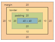
- 标准盒模型
盒的width 和 height是指盒content的width 和 height。
- 替代(IE)盒模型
盒的width 和 height是指盒(content + padding + border)的width 和 height。
- box-sizing属性
box-sizing 属性定义了 user agent 应该如何计算一个元素的总宽度和总高度。
- content-box:默认值,如果你设置一个元素的宽为 100px,那么这个元素的内容区会有 100px 宽,并且任何边框和内边距的宽度都会被增加到最后绘制出来的元素宽度中。
- border-box:你想要设置的边框和内边距的值是包含在 width 内的。也就是说,如果你将一个元素的 width 设为 100px,那么这 100px 会包含它的 border 和 padding,内容区的实际宽度是 width 减去 (border + padding) 的值。大多数情况下,这使得我们更容易地设定一个元素的宽高。
Element {
  box-sizing: content-box;  /*在宽度和高度之外绘制元素的内边距和边框*/
  box-sizing: border-box;  /*为元素指定的任何内边距和边框都将在已设定的宽度和高度内进行绘制*/
  box-sizing: inherit;  /*规定应从父元素继承 box-sizing 属性的值*/

  /*兼容性*/
  box-sizing:border-box;
  -moz-box-sizing:border-box; /* Firefox */
  -webkit-box-sizing:border-box; /* Safari */
}
块级盒子(Block box)
块级盒子(Block box),即具备完整盒子模型相关属性与特征的盒子,其中块级元素会创建块级盒子。
内联盒子 (inline box)
内联盒子 (inline box),即不具备完整盒子模型相关属性与特征的盒子,其中内联元素会创建内联盒子。
定位
定义如何将元素在页面中进行绝对定位和相对定位。
inset
CSS 属性 inset 为简写属性,对应于 top、right、bottom 和 left 属性。
Element {
  /* 长度值 */
  inset: 10px; /* 应用于所有边 */
  inset: 4px 8px; /* 上下 | 左右 */
  inset: 5px 15px 10px; /* 上 | 左右 | 下 */
  inset: 2.4em 3em 3em 3em; /* 上 | 右 | 下 | 左 */

  /* 包含块的宽度(左或右)或高度(上或下)的百分比 */
  inset: 10% 5% 5% 5%;

  /* 关键词值 */
  inset: auto;

  /* 全局值 */
  inset: inherit;
  inset: initial;
  inset: revert;
  inset: revert-layer;
  inset: unset;
}

// 等同于
Element {
  top: ;
  right: ;
  bottom: ;
  left: ;
}
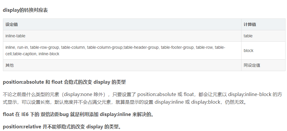
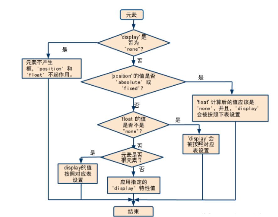
display转换的对应表
display、float、position
相关CSS 属性
- top、right、bottom、left。
- position、display、visibility。
- float、clear、z-index。
影响fixed上文基准样式属性
position受到转换属性transform的影响,会改变定位基准。任何非 none 的 transform 值都会导致一个堆叠上下文(Stacking Context)和包含块(Containing Block)的创建。
- transform 属性不为 none 的元素
- perspective 的值不为 none 的元素
- 在 will-change 中指定了任意 css 属性
定位类型 position
- 静态定位 static:即元素在文档常规流中当前的布局位置。此时,top, right, bottom, left 和 z-index 属性无效。
- 文档流:静态定位的元素并未脱离文档流。
- 相对定位 relative:元素先放置在未添加定位时的位置,再在不改变页面布局的前提下调整元素位置(因此会在此元素未添加定位时所在位置留下空白)。
- 文档流:相对定位的元素并未脱离文档流。
- 绝对定位 absolute:元素会被移出正常文档流,并不为元素预留空间,通过指定元素相对于最近的非 static 定位祖先元素的偏移,来确定元素位置。
- 文档流:绝对定位的元素则脱离了文档流。
- 粘性定位 strick:元素会被移出正常文档流,并不为元素预留空间,而是通过指定元素相对于屏幕视口(viewport)的位置来指定元素位置。
- 文档流:粘性定位的元素并未脱离文档流。
- 位置:元素的位置在屏幕滚动时不会改变,偏移值不会影响任何其他元素的位置。
浮动元素
浮动元素是 float 的计算值非 none 的元素。
注意事项
由于 float 意味着使用块布局,它在某些情况下会修改 display 值的计算值。
Display(显示)
隐藏某个元素,且隐藏的元素不会占用任何空间。
- none:隐藏元素。
- inline:内联元素不从新行开始,仅占用所需的宽度。
- inline-block:块级内联布局。
- block:块级元素总是从新行开始,并占据可用的全部宽度(尽可能向左和向右伸展)。
- flex:盒子布局。
- 其他
Visibility(可见性)
注意事项
子级元素或孙级元素有设置visibility属性,则子级元素或孙级元素不受到父级设置visibility属性影响。
隐藏某个元素,但隐藏的元素仍需占用与未隐藏之前一样的空间。
- hidden:隐藏元素,但是其他元素的布局不改变,相当于此元素变成透明。要注意若将其子元素设为 visibility: visible,则该子元素依然可见。
- visible:元素正常显示
- collapse:用于
<table>行、列、列组和行组,隐藏表格的行或列,并且不占用任何空间(与将 display: none 用于表格的行/列上的效果相 当)。但是,仍会计算其他行和列的大小,就好像折叠的行或列中的单元格一样。折叠的弹性项目被隐藏,他们将占用的空间被删除。对于 XUL 元素,元素的计算大小始终为零,而且通常会忽略影响大小的其他样式,尽管边距仍然有效。对于其他元素,折叠处理与隐藏相同。
重要通知
collapse此值允许从表中快速删除行或列,而不强制重新计算整个表的宽度和高度。
布局
是一种基于盒子与其兄弟和祖辈盒子的交互方式来确定盒子的位置和大小的算法。
注意事项
一个元素的尺寸和位置经常受其包含块 (containing block)的影响。
正常布局流
正常布局流是一套在浏览器视口内放置、组织元素的系统。
- 取得元素的内容来放在一个独立的元素盒子中,然后在其周边加上内边距、边框和外边距。
- 一个块级元素的内容宽度是其父元素的 100%,其高度与其内容高度一致。
- 内联元素的 height width 与内容一致。
- 块级元素按照基于其父元素的书写顺序(默认值: horizontal-tb) 的块流动方向 (block flow direction)放置。
- 每个块级元素会在上一个元素下面另起一行,它们会被设置好的 margin 分隔。
- 对于内联元素,只要在其父级块级元素的宽度内有足够的空间,它们与其他内联元素、相邻的文本内容(或者被包裹的)被安排在同一行。如果空间不够,溢出的文本或元素将移到新的一行。
- 如果两个相邻的元素都设置了 margin 并且两个 margin 有重叠,那么更大的设置会被保留,小的则会消失。
脱离常规流元素
- floated:浮动的元素
- position: 通过设置 position 属性为 absolute 或者 fixed 的元素
- root element: (html) 根元素
BFC布局
BFC(Block Formatting Context),即块级格式化上下文,是 Web 页面的可视 CSS 渲染的一部分,是块级盒子的布局过程发生的区域,也是浮动元素与其他元素交互的区域。
注意事项
格式化上下文影响布局,通常我们会为定位和清除浮动创建新的 BFC,而不是更改布局。
- 包含内部浮动:让浮动内容和周围的内容等高。
- 排除外部浮动
- 阻止外边距重叠:创建新的 BFC 避免两个相邻的 div 之间 外边距重叠 。
创建BFC的任一条件
- 根元素(
<html>) - 浮动元素(float 值不为 none)
- 绝对定位元素(position 值为 absolute 或 fixed)
- 行内块元素(display 值为 inline-block)
- 表格单元格(display 值为 table-cell,HTML 表格单元格默认值)
- 表格标题(display 值为 table-caption,HTML 表格标题默认值)
- 匿名表格单元格元素(display 值为 table、table-row、 table-row-group、table-header-group、table-footer-group(分别是 HTML table、tr、tbody、thead、tfoot 的默认值)或 inline-table)
- overflow 值不为 visible、clip 的块元素
- display 值为 flow-root 的元素
- contain 值为 layout、content 或 paint 的元素
- 弹性元素(display 值为 flex 或 inline-flex 元素的直接子元素),如果它们本身既不是 flex、grid 也不是 table 容器
- 网格元素(display 值为 grid 或 inline-grid 元素的直接子元素),如果它们本身既不是 flex、grid 也不是 table 容器
- 多列容器(column-count 或 column-width (en-US) 值不为 auto,包括column-count 为 1)
- column-span 值为 all 的元素始终会创建一个新的 BFC,即使该元素没有包裹在一个多列容器中
应用
清除内部浮动 自适应两栏布局 防止垂直 margin 重叠:声明float: left;
触发元素生成BFC机制
声明 float属性不为none 声明 display为inline-block, table-cell, table-caption, flex, inline-flex 声明 overflow为hidden
根元素 position为absolute或fixed
外边距重叠
块的上外边距 (margin-top)和下外边距 (margin-bottom)有时合并 (折叠) 为单个边距,其大小为单个边距的最大值 (或如果它们相等,则仅为其中一个),这种行为称为边距折叠。
- 形成外边距重叠的三种情况
- 同一层相邻元素之间
- 没有内容将父元素和后代元素分开
- 空的块级元素
<!--问题一:margin存在垂直重叠-->
  <div style='border: 1px solid #f00; position: relative;'>
    <div style='height: 50px; background: #aaa; margin: 20px;'>目录</div>
    <div style='height: 50px; background: #ccc; margin: 20px;'>内容(上下相邻两个元素margin重叠)</div>
  </div>

<!--添加BFC布局后-->
<div style='border: 1px solid #f00; position: relative;'>
  <div style='height: 50px; background: #aaa; margin: 20px;'>目录</div>
  <div style='overflow: hidden;'>
    <div style='height: 50px; background: #ccc; margin: 20px;'>内容(解决上下相邻两个元素重叠)</div>
  </div>
</div>
浮动元素未参与内容高度计算
<div style='border: 5px solid #f00; border-left-color: #0f0; position: relative;'>
  <div style='width: 300px; height: 50px; background: #aaa; float: left;'>目录</div>
  <div style='height: 50px; background: #ccc; float: left;'>内容(高度未参与计算)</div>
</div>

<!--添加BFC布局后-->
<div style='border: 5px solid #f00; border-left-color: #0f0; position: relative; overflow: hidden;'>
  <div style='width: 300px; height: 50px; background: #aaa; float: left;'>目录</div>
  <div style='height: 50px; background: #ccc; float: left;'>内容(触发外部容器BFC,高度将重新计算)</div>
</div>
块布局
用来布置文件。块布局包含以文档为中心的功能,例如 浮动元素或将其放置在多列上的功能。
行内布
用来布置文本。
表格布局
用来布置表格。
定位布局
用来对那些与其他元素无交互的定位元素进行布置 。
弹性盒子布局
用来布置那些可以顺利调整大小的复杂页面。
网格布局
用来布置那些与一个固定网格相关的元素。
IFC
IFC(Inline formatting context),即内联格式化上下文。
水平垂直居中
  <style type="text/css">
    div.frame {
      position: relative;
      width: 200px;
      height: 200px;
      border: 5px solid rgb(44, 26, 26);
    }
    div.box {
      width: 100px;
      height: 100px;
      background-color: blueviolet;
    }

    div.box-1 {
      margin: auto;
      position: absolute;
      top: 0;
      right: 0;
      bottom: 0;
      left: 0;
    }

    div.frame-2 {
      display: flex;
      justify-content: center;
      align-items: center;
    }

    div.box-3 {
      position: absolute;
      top: 50%;
      left: 50%;
      transform: translate(-50%, -50%);
    }

    div.frame-4 {
      display: table-cell;
      text-align: center;
      vertical-align: middle;
    }
    div.box-4 {
      display: inline-block;
    }
  </style>

  <body data-url="https://test.ysunlight.com/WEB/css/〔面试题库〕/水平垂直居中.html">

    <div class="frame"> <div class="box box-1"></div>  </div>
    <div class="frame frame-2"> <div class="box box-2"></div>  </div>
    <div class="frame frame-3"> <div class="box box-3"></div>  </div>
    <div class="frame frame-4"> <div class="box box-4"></div>  </div>

  </body>
网格布局
网格是由行和列构成的一种布局模式,通过display: grid | inline-grid;声明布局是否为网格布局。
轨道
想要对行列进行像素级(px)的控制,则需要设置行列的轨道
{
  /**
   * 行:100 行,每行行高为 10px
   * 列:100 列,每列列宽为 10px
   *
   * 注意 gap 间距会影响子元素的实际宽高值
   */
  grid-template-columns: repeat(100, 10px);
  grid-template-rows: repeat(100, 10px);
}
示例
<style type="text/css">
  .layout-content {
    position: relative;
    width: 100%;
    height: 2000px;
    display: grid;
    gap: 0;

    border: 10px solid #f00;
    background-color: rgba(0, 0, 0, 0.1);

    grid-template-columns: 1fr 1fr;
    /* 核心修改:用自动行高替代固定行数,每行高度1px,行数按需生成 */
    grid-auto-rows: 1px;
    /* 移除原有的固定行数设置:grid-template-rows: repeat(2000, 1px); */
  }

  .layout-content div:nth-of-type(1) {
    grid-row: 1 / 801;
    margin-right: 12px;
  }
  .layout-content div:nth-of-type(2) {
    grid-row: 1 / 457;
    margin-left: 12px;
  }
  .layout-content div:nth-of-type(3) {
    grid-row: 801 / 1409;
    margin-top: 20px;
    margin-right: 12px;
  }
  .layout-content div:nth-of-type(4) {
    grid-row-end: span 476;
    margin-top: 20px;
    margin-left: 12px;
  }
  .layout-content div:nth-of-type(5) {
    grid-row-end: span 476;
    margin-top: 20px;
    margin-left: 12px;
  }
  .layout-content
    div:not(
      :nth-of-type(1),
      :nth-of-type(2),
      :nth-of-type(3),
      :nth-of-type(4),
      :nth-of-type(5)
    ) {
    grid-column: span 2;
    grid-row-end: span 476;
    margin-top: 20px;
  }
</style>


<div class="layout-content">
  <div style="background-color: rgb(134, 42, 183)"></div>
  <div style="background-color: rgb(57, 152, 69)"></div>
  <div style="background-color: rgb(217, 176, 13)"></div>
  <div style="background-color: rgb(38, 121, 140)"></div>
  <div style="background-color: rgb(20, 208, 49)"></div>
  <div style="background-color: rgb(134, 42, 183)"></div>
  <div style="background-color: rgb(20, 208, 49)"></div>
</div>
基本语法
/** 可以对网格元素进行命名 */
.item1 {
  grid-area: myArea;
}
.grid-container {
  grid-template-areas: 'myArea myArea myArea myArea myArea';
}
网格容器
网格容器内放置着由列和行内组成的网格元素。
grid:指grid-template-rows, grid-template-columns, grid-template-areas, grid-auto-rows, grid-auto-columns, 以及 grid-auto-flow 的简写属性
grid-template:指grid-template-rows, grid-template-columns 和 grid-areas 的简写属性
grid-template-columns:定义了网格布局中的列的数量,它也可以设置每个列的宽度。
grid-template-rows:定义了网格布局中的行的数量,它也可以设置每一行的高度。
grid-gap:指grid-row-gap 和 grid-column-gap 的简写属性,目前已废弃,被gap替换。
gap:指row-gap 和 column-gap 的简写属性
column-gap:指定列之间的间隙
row-gap:指定两个行之间的间距
justify-content:与盒子布局用法一致,用于网格容器。
align-content:与盒子布局用法一致,用于网格容器。
grid-area:指定网格元素的名称,或者也可以是 grid-row-start, grid-column-start, grid-row-end, 和 grid-column-end 的简写属性
grid-area:可以对网格元素进行命名。充分利用该属性,可以实现调整网格元素的顺序。
grid-auto-columns:指定的默认的列尺寸
grid-auto-columns: auto|max-content|min-content|length;
- grid-auto-flow:指定自动布局算法怎样运作,精确指定在网格中被自动布局的元素怎样排列。
grid-auto-flow: row|column|dense|row dense|column dense;
- grid-auto-rows:指定的默认的行尺寸
grid-auto-rows: auto|max-content|min-content|length;
- grid-template-areas:指定如何显示行和列,使用命名的网格元素
代码示例
Parent {
  display: grid;

  /** fr 单位 */
  grid-template-columns: 1fr 1fr 1fr;


  /** 重复构建轨道组 */
  grid-template-columns: repeat(3, 1fr);
  /** 自动使用多列填充 */
  grid-template-columns: repeat(auto-fill, minmax(200px, 1fr));


  /** 定义网格中的列 */
  grid-template-columns
  /** 声明 三个自动布局的列 */
  grid-template-columns: auto auto auto;
  /** 声明 五个具体宽度列 */
  grid-template-columns: 50px 50px 100px 100px 200px;

  grid-template-columns: 300px 1fr 1fr;
  grid-template-rows: 210px 210px;


  /** 定义网格中的行 */
  grid-template-rows
  /** 定义第一行高度为 100px,第二行高度为 300px。 */
  grid-template-rows: 100px 300px;


  grid-template-areas


  grid-auto-rows
  grid-auto-rows: 100px;
  grid-auto-rows: minmax(100px, auto); /** 至少 100 像素 */


  grid-auto-columns


  /** 网格间距 */
  gap: 20px;
}
网格元素
grid-column:指grid-column-start 和 grid-column-end 的简写属性,可以使用关键字 "span" 来定义元素将跨越的列数。
grid-column-end:指定网格元素列的结束位置
grid-column-gap:指定网格元素的间距大小
grid-column-start:指定网格元素列的开始位置
grid-row:指grid-row-start 和 grid-row-end 的简写属性
grid-row-end:指定网格元素行的结束位置
grid-row-gap:指定网格元素的行间距
grid-row-start:指定网格元素行的开始位置
Child {
  grid-column: span 2;  /** 占2列 */
  grid-column: span 3;  /** 占3列 */


  /** 一个网格元素的网格线从第一列开始,第三列结束(不包括第三列) */
  grid-column-start: 1;
  grid-column-end: 3;

  grid-column: 1 / 3;
  /** 设置 "item1" 跨越 3 列 */
  grid-column: 1 / span 3;


  /** 一个网格元素的网格线从第一行开始,第三行结束(不包括第三行) */
  grid-row-start: 1;
  grid-row-end: 3;
  grid-row: 1 / 3;
  /** 使用关键字 "span" 来定义元素将跨越的行数 */
  grid-row: 1 / span 2;


  /** grid-area: grid-row-start / grid-column-start / grid-row-end / grid-column-end | itemname; */
  /** 可以使用关键字 "span" 来定义元素将跨越的列数。 */
  grid-area: 2 / 1 / span 2 / span 3;
}
repeat()
表示轨道列表的重复片段,允许以更紧凑的形式写入大量显示重复模式的列或行。
min()
从逗号分隔符表达式中选择一个最小值作为 CSS 的属性值。
max()
从一个逗号分隔的表达式列表中选择最大(正方向)的值作为属性的值。
minmax()
定义了一个长宽范围的闭区间。
- max-content:表示网格的轨道长度自适应内容最大的那个单元格。
- min-content:表示网格的轨道长度自适应内容最小的那个单元格。
fit-content()
案例一
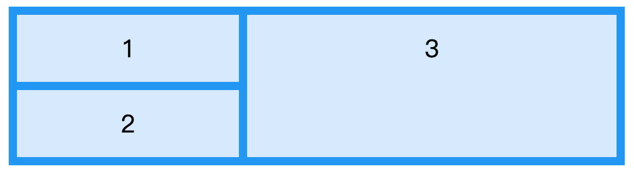
<div class="grid-container">
  <div class="item1">1</div>
  <div class="item2">2</div>
  <div class="item3">3</div>
</div>

<style type="text/css">
.grid-container {
  display: grid;
  grid-template-columns: 270px 1fr 1fr;
  grid-gap: 10px;
  background-color: #2196F3;
  padding: 10px;
}

.grid-container > div {
  background-color: rgba(255, 255, 255, 0.8);
  text-align: center;
  padding: 20px 0;
  font-size: 30px;
}
.item2 {
  grid-column-start: 1;
}
.item3 {
  grid-column: 2 / span 2;
  grid-row: 1 / span 2;
}
</style>
瀑布流实现
<style type="text/css">
  section {
    display: grid;
    /* grid-template-columns: repeat(auto-fill, minmax(150px, 1fr)); */
    grid-template-columns: 1fr 1fr;
    grid-gap: 10px;
  }
  div {
    position: relative;
  }
</style>


<section>
  <div style="height: 100px;grid-row-end: span 10;background-color: antiquewhite;">1</div>
  <div style="height: 170px; grid-row-end: span 17; background-color: aqua">2</div>
  <div
    style="
      height: 200px;
      grid-row-end: span 20;
      background-color: aquamarine;
    "
  >
    3
  </div>
  <div
    style="height: 180px; grid-row-end: span 18; background-color: azure"
  >
    4
  </div>
  <div
    style="height: 250px; grid-row-end: span 25; background-color: bisque"
  >
    5
  </div>
  <div
    style="height: 300px; grid-row-end: span 30; background-color: black"
  >
    6
  </div>
  <div
    style="
      height: 100px;
      grid-row-end: span 10;
      background-color: blanchedalmond;
    "
  >
    7
  </div>
  <div style="height: 360px; grid-row-end: span 36; background-color: blue">
    8
  </div>
  <div
    style="
      height: 470px;
      grid-row-end: span 47;
      background-color: blueviolet;
    "
  >
    9
  </div>
</section>
瀑布流实现
<!DOCTYPE html>
<html lang="zh-CN">
  <head>
    <meta charset="UTF-8" />
    <meta name="viewport" content="width=device-width, initial-scale=1.0" />
    <title>CSS瀑布流布局</title>
    <style>
      .waterfall-container {
        display: grid;
        grid-template-columns: repeat(auto-fill, minmax(250px, 1fr));
        grid-auto-rows: 10px; /* 控制行高基数 */
        grid-gap: 15px;
        padding: 15px;
      }

      .waterfall-item {
        background: #f0f0f0;
        border-radius: 8px;
        overflow: hidden;
        box-shadow: 0 2px 5px rgba(0, 0, 0, 0.1);
        transition: all 0.3s ease;
      }

      .waterfall-item:hover {
        transform: translateY(-5px);
        box-shadow: 0 5px 15px rgba(0, 0, 0, 0.2);
      }

      .waterfall-item img {
        width: 100%;
        height: auto;
        display: block;
      }

      .waterfall-item-content {
        padding: 15px;
      }

      /* 为每个项目设置不同的高度 */
      .waterfall-item:nth-child(1) {
        grid-row-end: span 30;
      }
      .waterfall-item:nth-child(2) {
        grid-row-end: span 45;
      }
      .waterfall-item:nth-child(3) {
        grid-row-end: span 25;
      }
      .waterfall-item:nth-child(4) {
        grid-row-end: span 35;
      }
      .waterfall-item:nth-child(5) {
        grid-row-end: span 40;
      }
      .waterfall-item:nth-child(6) {
        grid-row-end: span 30;
      }
      .waterfall-item:nth-child(7) {
        grid-row-end: span 50;
      }
      .waterfall-item:nth-child(8) {
        grid-row-end: span 25;
      }
      .waterfall-item:nth-child(9) {
        grid-row-end: span 35;
      }
      .waterfall-item:nth-child(10) {
        grid-row-end: span 45;
      }
    </style>
  </head>
  <body>
    <div class="waterfall-container">
      <div class="waterfall-item">
        <img src="https://picsum.photos/300/200?random=1" alt="示例图片" />
        <div class="waterfall-item-content">
          <h3>项目标题1</h3>
          <p>这里是项目描述内容,高度会根据内容自动调整。</p>
        </div>
      </div>
      <div class="waterfall-item">
        <img src="https://picsum.photos/300/300?random=2" alt="示例图片" />
        <div class="waterfall-item-content">
          <h3>项目标题2</h3>
          <p>
            这里是项目描述内容,高度会根据内容自动调整。这里是项目描述内容,高度会根据内容自动调整。
          </p>
        </div>
      </div>
      <div class="waterfall-item">
        <img src="https://picsum.photos/300/250?random=3" alt="示例图片" />
        <div class="waterfall-item-content">
          <h3>项目标题3</h3>
          <p>这里是项目描述内容。</p>
        </div>
      </div>
      <div class="waterfall-item">
        <img src="https://picsum.photos/300/350?random=4" alt="示例图片" />
        <div class="waterfall-item-content">
          <h3>项目标题4</h3>
          <p>这里是项目描述内容,高度会根据内容自动调整。</p>
        </div>
      </div>
      <div class="waterfall-item">
        <img src="https://picsum.photos/300/400?random=5" alt="示例图片" />
        <div class="waterfall-item-content">
          <h3>项目标题5</h3>
          <p>
            这里是项目描述内容,高度会根据内容自动调整。这里是项目描述内容,高度会根据内容自动调整。
          </p>
        </div>
      </div>
      <div class="waterfall-item">
        <img src="https://picsum.photos/300/200?random=6" alt="示例图片" />
        <div class="waterfall-item-content">
          <h3>项目标题6</h3>
          <p>这里是项目描述内容。</p>
        </div>
      </div>
      <div class="waterfall-item">
        <img src="https://picsum.photos/300/500?random=7" alt="示例图片" />
        <div class="waterfall-item-content">
          <h3>项目标题7</h3>
          <p>
            这里是项目描述内容,高度会根据内容自动调整。这里是项目描述内容,高度会根据内容自动调整。这里是项目描述内容,高度会根据内容自动调整。
          </p>
        </div>
      </div>
      <div class="waterfall-item">
        <img src="https://picsum.photos/300/250?random=8" alt="示例图片" />
        <div class="waterfall-item-content">
          <h3>项目标题8</h3>
          <p>这里是项目描述内容。</p>
        </div>
      </div>
      <div class="waterfall-item">
        <img src="https://picsum.photos/300/350?random=9" alt="示例图片" />
        <div class="waterfall-item-content">
          <h3>项目标题9</h3>
          <p>这里是项目描述内容,高度会根据内容自动调整。</p>
        </div>
      </div>
      <div class="waterfall-item">
        <img src="https://picsum.photos/300/450?random=10" alt="示例图片" />
        <div class="waterfall-item-content">
          <h3>项目标题10</h3>
          <p>
            这里是项目描述内容,高度会根据内容自动调整。这里是项目描述内容,高度会根据内容自动调整。
          </p>
        </div>
      </div>
    </div>
  </body>
</html>
弹性盒子(Flexbox )
弹性盒( Flexible Box 或 flexbox),是一种当页面需要适应不同的屏幕大小以及设备类型时确保元素拥有恰当的行为的布局方式。
- 弹性盒子由弹性容器(Flex container)和弹性子元素(Flex item)组成。
- 弹性容器通过设置 display 属性的值为 flex 或 inline-flex将其定义为弹性容器。
- 弹性容器内包含了一个或多个弹性子元素。
Element {
  display: -webkit-flex;
  display: flex;
}
弹性容器属性
flex-direction
指定了弹性子元素在父容器中的位置,取值: row | row-reverse | column | column-reverse。
- row:横向从左到右排列(左对齐),默认的排列方式。
- row-reverse:反转横向排列(右对齐,从后往前排,最后一项排在最前面。
- column:纵向排列。
- column-reverse:反转纵向排列,从后往前排,最后一项排在最上面。
Element {
  flex-direction: column;
  -moz-flex-direction: column;
  -ms-flex-direction: column;
  -webkit-flex-direction: column;
}
justify-content
应用在弹性容器上,把弹性项沿着弹性容器的主轴线(main axis)对齐,取值: flex-start | flex-end | center | space-between | space-around。
- flex-start:弹性项目向行头紧挨着填充。这个是默认值。第一个弹性项的main-start外边距边线被放置在该行的main-start边线,而后续弹性项依次平齐摆放。
- flex-end:弹性项目向行尾紧挨着填充。第一个弹性项的main-end外边距边线被放置在该行的main-end边线,而后续弹性项依次平齐摆放。
- center:弹性项目居中紧挨着填充。(如果剩余的自由空间是负的,则弹性项目将在两个方向上同时溢出)。
- space-between:弹性项目平均分布在该行上。如果剩余空间为负或者只有一个弹性项,则该值等同于flex-start。否则,第1个弹性项的外边距和行的main-start边线对齐,而最后1个弹性项的外边距和行的main-end边线对齐,然后剩余的弹性项分布在该行上,相邻项目的间隔相等。
- space-around:弹性项目平均分布在该行上,两边留有一半的间隔空间。如果剩余空间为负或者只有一个弹性项,则该值等同于center。否则,弹性项目沿该行分布,且彼此间隔相等(比如是20px),同时首尾两边和弹性容器之间留有一半的间隔(1/2*20px=10px)。
Element {
  justify-content: center;
  -webkit-justify-content: center;
  -moz-justify-content: center;
}
align-items
设置或检索弹性盒子元素在侧轴(纵轴)方向上的对齐方式,取值: flex-start | flex-end | center | baseline | stretch。
- flex-start:弹性盒子元素的侧轴(纵轴)起始位置的边界紧靠住该行的侧轴起始边界。
- fflex-end:弹性盒子元素的侧轴(纵轴)起始位置的边界紧靠住该行的侧轴结束边界。
- fcenter:弹性盒子元素在该行的侧轴(纵轴)上居中放置。(如果该行的尺寸小于弹性盒子元素的尺寸,则会向两个方向溢出相同的长度)。
- fbaseline:如弹性盒子元素的行内轴与侧轴为同一条,则该值与'flex-start'等效。其它情况下,该值将参与基线对齐。
- fstretch:如果指定侧轴大小的属性值为'auto',则其值会使项目的边距盒的尺寸尽可能接近所在行的尺寸,但同时会遵照'min/max-width/height'属性的限制。
Element {
  align-items: center;
  -webkit-align-items: center;
}
flex-wrap
用于指定弹性盒子的子元素换行方式,取值: nowrap | wrap | wrap-reverse | initial | inherit。
- nowrap - 默认, 弹性容器为单行。该情况下弹性子项可能会溢出容器。
- wrap - 弹性容器为多行。该情况下弹性子项溢出的部分会被放置到新行,子项内部会发生断行
- wrap-reverse -反转 wrap 排列。
flex-wrap: wrap;
align-content
用于修改 flex-wrap 属性的行为,但它不是设置弹性子元素的对齐,而是设置各个行的对齐,取值: flex-start | flex-end | center | space-between | space-around | stretch。
- stretch - 默认。各行将会伸展以占用剩余的空间。
- flex-start - 各行向弹性盒容器的起始位置堆叠。
- flex-end - 各行向弹性盒容器的结束位置堆叠。
- center -各行向弹性盒容器的中间位置堆叠。
- space-between -各行在弹性盒容器中平均分布。
- space-around - 各行在弹性盒容器中平均分布,两端保留子元素与子元素之间间距大小的一半。
flex-flow
是 flex-direction 和 flex-wrap 属性的复合属性,用于设置或检索弹性盒模型对象的子元素排列方式,取值: flex-direction flex-wrap|initial|inherit;。
gap属性
Element {
  display: -webkit-flex;
  display: flex;

  gap: 10px;
  gap: 20px 5px;
}
弹性子元素属性
order
设置弹性盒子的子元素排列顺序,数值小的排在前面。
{

}
align-self
用于设置弹性元素自身在侧轴(纵轴)方向上的对齐方式,取值: auto | flex-start | flex-end | center | baseline | stretch。
- auto:如果'align-self'的值为'auto',则其计算值为元素的父元素的'align-items'值,如果其没有父元素,则计算值为'stretch'。
- flex-start:弹性盒子元素的侧轴(纵轴)起始位置的边界紧靠住该行的侧轴起始边界。
- flex-end:弹性盒子元素的侧轴(纵轴)起始位置的边界紧靠住该行的侧轴结束边界。
- center:弹性盒子元素在该行的侧轴(纵轴)上居中放置。(如果该行的尺寸小于弹性盒子元素的尺寸,则会向两个方向溢出相同的长度)。
- baseline:如弹性盒子元素的行内轴与侧轴为同一条,则该值与'flex-start'等效。其它情况下,该值将参与基线对齐。
- stretch:如果指定侧轴大小的属性值为'auto',则其值会使项目的边距盒的尺寸尽可能接近所在行的尺寸,但同时会遵照'min/max-width/height'属性的限制。
{
}
flex
用于指定弹性子元素如何分配空间。flex: flex-grow flex-shrink flex-basis|auto|initial|inherit;
flex: auto | initial | none | inherit | [ flex-grow ] || [ flex-shrink ] || [ flex-basis ]
auto: 计算值为 1 1 auto
initial: 计算值为 0 1 auto
none:计算值为 0 0 auto
inherit:从父元素继承
[ flex-grow ]:定义弹性盒子元素的扩展比率。
[ flex-shrink ]:定义弹性盒子元素的收缩比率。
[ flex-basis ]:定义弹性盒子元素的默认基准值。
{
  /** 与父元素相同宽度 */
  flex: 0 0 100%;
}
flex-grow
定义弹性盒子元素的扩展比率。
{

}
flex-shrink
定义弹性盒子元素的收缩比率,flex 元素仅在默认宽度之和大于容器的时候才会发生收缩。
{

}
flex-basis
定义弹性盒子元素的默认基准值。
- flex: auto | initial | none | inherit | [ flex-grow ] || [ flex-shrink ] || [ flex-basis ]
- auto: 计算值为 1 1 auto | [ flex-grow ] || [ flex-shrink ] || [ flex-basis ]
- initial: 计算值为 0 1 auto | [ flex-grow ] || [ flex-shrink ] || [ flex-basis ]
- none:计算值为 0 0 auto | [ flex-grow ] || [ flex-shrink ] || [ flex-basis ]
Element {
  flex-shrink: 0; /**不收缩 */
  flex-grow: 0; /**不扩展 */
  -webkit-flex-shrink: 0;
  -webkit-flex-grow: 0;

  flex: 1;
  -webkit-flex: 1;
  -ms-flex: 1;
  -moz-flex: 1;
}
继承与非继承属性
继承属性
含义:当元素的一个继承属性 (inherited property)没有指定值时,则取父元素的同属性的计算值 computed value
- 所有元素可继承:visibility、cursor
- 内联元素可继承:letter-spacing、word-spacing、white-space、line-height、color、font、 font-family、font-size、font-style、font-variant、font-weight、text- decoration、text-transform、direction
- 块状元素可继承:text-indent和text-align
- 列表元素可继承:list-style、list-style-type、list-style-position、list-style-image
- 表格元素可继承:border-collapse
非继承属性
当元素的一个非继承属性(在Mozilla code 里有时称之为reset property )没有指定值时,则取属性的初始值 initial value
- 定位属性:display、background、overflow、position、z-index、float、clear、table-layout、vertical-align等。
- 盒属性:margin、border、padding、height、min-height、max-height、width、min-width、max-width、left、right、top、 bottom等。
属性大全
文本(Text) 属性
- white-space 属性: 指定元素内的空白怎样处理。
- normal 默认。空白会被浏览器忽略。
- pre 空白会被浏览器保留。其行为方式类似 HTML 中的
<pre>标签。 - nowrap 文本不会换行,文本会在在同一行上继续,直到遇到
<br>标签为止。 - pre-wrap 保留空白符序列,但是正常地进行换行。
- pre-line 合并空白符序列,但是保留换行符。
- inherit 规定应该从父元素继承 white-space 属性的值。
Element {
  /**
   * 字母大小写规则
   * uppercase: 所有字母大写
   * lowercase: 所有字母小写
   * capitalize: 每个单词的首字母大写
   */
  text-transform: uppercase | lowercase | capitalize;

  /* 设置文本的对齐方式 */
  text-align: center left right justify;

  text-decoration: underline;


  /**
   * 指定非CJK脚本的断行规则
   * normal: 使用浏览器默认的换行规则。
   * break-all: 允许在单词内换行。
   * keep-all: 只能在半角空格或连字符处换行。
   */
  word-break: normal | break-all | keep-all;

  /**
   * 允许长的内容可以自动换行
   *
   */
  word-wrap: normal | break-word;


  /**
   *
   *
   */


  /**
   *
   *
   */


  /**
   *
   *
   */


  /**
   *
   *
   */
}
属性列表
----------------------------------------------------------------------------------
  属性	                说明                                         	CSS
----------------------------------------------------------------------------------
  color	               设置文本的颜色	1
  direction	           规定文本的方向 / 书写方向	2
  letter-spacing	     设置字符间距	1
  line-height	         设置行高	1
  text-align	         规定文本的水平对齐方式	1
  text-decoration	     规定添加到文本的装饰效果	1
  text-indent	         规定文本块首行的缩进	1
  text-transform	     控制文本的大小写	1
  unicode-bidi	 	2
  vertical-align	     设置元素的垂直对齐方式	1
  white-space          设置怎样给一元素控件留白	1
  word-spacing	       设置单词间距	1
  text-emphasis	       向元素的文本应用重点标记以及重点标记的前景色。	1
  hanging-punctuation	 指定一个标点符号是否可能超出行框	3
  punctuation-trim	   指定一个标点符号是否要去掉	3
  text-align-last	     当 text-align 设置为 justify 时,最后一行的对齐方式。	3
  text-justify	       当 text-align 设置为 justify 时指定分散对齐的方式。	3
  text-outline	       设置文字的轮廓。	3
  text-overflow	       指定当文本溢出包含的元素,应该发生什么	3
  text-shadow	         为文本添加阴影	3
  text-wrap	           指定文本换行规则	3
  word-break	         指定非CJK文字的断行规则,	3
  word-wrap	           设置浏览器是否对过长的单词进行换行。	3
----------------------------------------------------------------------------------

# CJK脚本是中国,日本和韩国("中日韩")脚本。
换行
/*強制換行*/
Element {
  word-wrap:break-word;  /*自动换行*/
  word-break:break-all;  /*强制英文单词断行*/
  text-overflow:ellipsis;
  overflow:hidden;  /*超出显示省略号*/
  white-space:nowrap;  /*强制不换行*/
}


/*禁止换行自动显示沈略符号*/
Element {
  white-space: nowrap;
  overflow: hidden;
  text-overflow: ellipsis;
}


/*限制行数省略号*/
Element {
  word-break: break-all;
  overflow: hidden;
  text-overflow: ellipsis;
  display: -webkit-box;
  -webkit-box-orient: vertical;
  -webkit-line-clamp: 2;
}


/*限制换行, 超出显示省略号*/
Element {
  overflow:hidden;
  white-space:nowrap;
  text-overflow:ellipsis;
}

/*限制行数, 超出显示省略号*/
Element {
  overflow: hidden;
  display: -webkit-box;
  word-break: break-all;
  text-overflow: ellipsis;
  -webkit-box-orient: vertical;
  -webkit-line-clamp: 2;
}
背景属性
/** 高度不变,当宽度缩放的时候,背景图片的中间不缩放,一直保持居中 */
div {
  height: 881px;
  background-image: url("https://natnah5h88khukyw-93956571425.shopifypreview.com/cdn/shop/files/PC-Spin.webp?v=1761978013");
  background-position: center center;
  background-size: auto 100%;
  background-repeat: no-repeat;
}


Element {
  background-color: initial;
  background-image: url(https://www.runoob.com/css/banner.png);
  background-repeat: no-repeat;  /* repeat | repeat-x | repeat-y | no-repeat */
  background-size: 100% 100%;
  background-position: top left;

  /*背面不显示 | 当元素旋转到背面之后是否显示*/
  backface-visibility: hidden;
}

Element {
  background-repeat: no-repeat;
  background-position: center center;
}


/*
 * background-origin:指定了背景图像的位置区域
 **/
Element {
  background-origin: content-box;  /*背景图像的相对位置的内容框*/
  background-origin: padding-box;  /*背景图像填充框的相对位置*/
  background-origin: border-box;   /*背景图像边界框的相对位置*/
}


/*
 * background-clip:背景剪裁属性是从指定位置开始绘制
 **/
Element {
  background-clip: content-box;  /*背景绘制在边框方框内(剪切成边框方框)*/
  background-clip: padding-box;  /*背景绘制在衬距方框内(剪切成衬距方框)*/
  background-clip: border-box;   /*背景绘制在内容方框内(剪切成内容方框)*/
}


/*
 * 线性渐变
 **/
Element {
  background-image: linear-gradient(#f00, #0f0);  /*从上到下*/
  background-image: linear-gradient(to right, #f00, #0f0);  /* 从左到右*/
  background-image: linear-gradient(to right bottom, #f00, #0f0);  /*对角*/
  background-image: linear-gradient(45deg, #f00, #0f0);  /*使用角度*/

  background-image: linear-gradient(#f00, #0f0, #00f);  /*使用多个颜色节点*/
  background-image: linear-gradient(45deg, rgba(255, 0, 0, 1), rgba(255, 0, 0, 0.5));  /*使用透明度*/
  background-image: linear-gradient(#000, #f00 10%, #0f0 20%);  /*重复的线性渐变*/
  background-image: linear-gradient(45deg, #f00, #0f0);  /**/
  background-image: linear-gradient(45deg, #f00, #0f0);  /**/
}

/** 示例 */
Element {
  position: relative;
  width: 60px;
  height: 60px;
  background: linear-gradient(180deg, #dfdfdf 0%, #fff 9%, #9f9f9f 46%, #f9f9f9 74%, #b1b1b1 95%, #808080 100%);
  box-shadow: 0px 3px 6px 1px rgba(0, 0, 0, 0.1);
  border-radius: 10px;
}


/*
 * 径向渐变
 **/
Element {
  background-image: radial-gradient(#f00, #0f0);  /*均匀分布*/
  background-image: radial-gradient(#f00, #0f0 50%, #00f);  /*非均匀分布*/

  width: 200px;
  height: 150px;
  background-image: radial-gradient(circle, #f00, #0f0);  /*设置形状, 争对非正方形时非常有效*/
  background-image: radial-gradient(ellipse, #f00, #0f0);

  background-image: radial-gradient(closest-side at 50% 50%, #f00, #0f0);  /*不同尺寸大小关键字的使用*/
  background-image: radial-gradient(farthest-side, #f00, #0f0);
  background-image: radial-gradient(closest-corner, #f00, #0f0);
  background-image: radial-gradient(farthest-corner, #f00, #0f0);

  background-image: radial-gradient(ellipse, #f00, #0f0);  /*重复的径向渐变*/

  background-image: radial-gradient(100px at left top, transparent 50%, #f00 50%);  /*边角圆弧*/
}
边框(Border)
/**
 * 边
 * border: 上 右 下 左
 */
Element {
  border: 1px solid #f00;

  border-top: 1px solid #f00;
  border-right: 1px solid #f00;
  border-bottom: 1px solid #f00;
  border-left: 1px solid #f00;
}

/**
 * 圆角
 * border-radius: 上 右 下 左
 */
Element {
  border-radius: 0px 0px 10px 10px;

  border-top-left-radius: 10px;
  border-bottom-left-radius: 10px;

  border-top-right-radius: 10px;
  border-bottom-right-radius: 10px;
}
轮廓(Outline) 属性
盒子(Box) 属性
颜色(Color) 属性
内边距(Padding) 属性
媒体页面内容属性
尺寸(Dimension) 属性
内容生成属性
内容生成属性(Generated Content Properties)
线框(Linebox) 属性
列表(List) 属性
外边距(Margin) 属性
字幕(Marquee) 属性
多列(Multi-column) 属性
页面媒体(Paged Media) 属性
定位(Positioning) 属性
表格(Table) 属性
table {
  table-layout: fixed; /* 宽度固定,td内容过长也不会被拉伸 */
  border-collapse: collapse; /* 设置表格的边框是否被合并为一个单一的边框 */
  empty-cells: hide; /* 设置是否显示表格中的空单元格(仅用于“分离边框”模式) */
}
用户外观(User-interface) 属性
- resize 属性:指定一个元素是否是由用户调整大小
- 语法:resize: none|both|horizontal|vertical
- none 用户无法调整元素的尺寸。
- both 用户可调整元素的高度和宽度。
- horizontal 用户可调整元素的宽度。
- vertical 用户可调整元素的高度。
分页(Print) 属性
语音(Speech) 属性
网格(Grid) 属性
超链接(Hyperlink) 属性
光标 cursor
/**
 * 鼠标指针光标类型
 *
 */
Element {
  cursor: default;	/* 默认光标(通常是一个箭头)*/
  cursor: auto;	/* 默认。浏览器设置的光标。*/
  cursor: crosshair;	/* 光标呈现为十字线。*/
  cursor: pointer;	/* 光标呈现为指示链接的指针(一只手)*/
  cursor: move;	/* 此光标指示某对象可被移动。*/
  cursor: e-resize;	/* 此光标指示矩形框的边缘可被向右(东)移动。*/
  cursor: ne-resize;	/* 此光标指示矩形框的边缘可被向上及向右移动(北/东)。*/
  cursor: nw-resize;	/* 此光标指示矩形框的边缘可被向上及向左移动(北/西)。*/
  cursor: n-resize;	/* 此光标指示矩形框的边缘可被向上(北)移动。*/
  cursor: se-resize;	/* 此光标指示矩形框的边缘可被向下及向右移动(南/东)。*/
  cursor: sw-resize;	/* 此光标指示矩形框的边缘可被向下及向左移动(南/西)。*/
  cursor: s-resize;	/* 此光标指示矩形框的边缘可被向下移动(南)。*/
  cursor: w-resize;	/* 此光标指示矩形框的边缘可被向左移动(西)。*/
  cursor: text;	/* 此光标指示文本。*/
  cursor: wait;	/* 此光标指示程序正忙(通常是一只表或沙漏)。*/
  cursor: help;	/* 此光标指示可用的帮助(通常是一个问号或一个气球)。*/
  cursor: not-not-allowed;  /* 禁用 */
  cursor: url('url');	/* 需使用的自定义光标的 URL。请在此列表的末端始终定义一种普通的光标,以防没有由 URL 定义的可用光标。*/
}
object-fit
<!--
  # 图片排版,如果前端不控制图片大小,整个排版就会很乱,如果给定长宽,图片又会变形,用背景图片来处理有特别麻烦。此属性实现图片不变形而且整体排版也不受影响。

  object-fit: fill | contain | cover | scale-down | none | initial | inherit;
  > object-fit:fill:被替换的内容大小可以填充元素的内容框。 整个对象将完全填充此框。 如果对象的高宽比不匹配其框的宽高比,那么该对象将被拉伸以适应。
  > object-fit:contain:保持原有尺寸比例。内容被缩放。被替换的内容将被缩放,以在填充元素的内容框时保持其宽高比。 整个对象在填充盒子的同时保留其长宽比,因此如果宽高比与框的宽高比不匹配,该对象将被添加“黑边”。
  > object-fit:cover:保持原有尺寸比例。但部分内容可能被剪切。被替换的内容大小保持其宽高比,同时填充元素的整个内容框。 如果对象的宽高比与盒子的宽高比不匹配,该对象将被剪裁以适应。
  > object-fit:none:被替换的内容尺寸不会被改变。
-->

<table>
  <thead>
    <td>属性值</td>
    <td>释义</td>
    <td>使用属性效果</td>
    <td>未使用前变形</td>
  </thead>
  <tbody>
    <td>contain</td>
    <td></td>
    <td><img style="object-fit:contain;" src="/Reference/image/9e2f0075d7.jpg" alt=""></td>
    <td><img src="/Reference/image/9e2f0075d7.jpg" alt=""></td>
  </tbody>
  <tbody>
    <td>cover</td>
    <td>根据原图宽高比裁剪填充满内容容器</td>
    <td><img style="object-fit:cover;" src="/Reference/image/9e2f0075d7.jpg" alt=""></td>
    <td><img src="/Reference/image/9e2f0075d7.jpg" alt=""></td>
  </tbody>
  <tbody>
    <td>fill</td>
    <td></td>
    <td><img style="object-fit:fill;" src="/Reference/image/9e2f0075d7.jpg" alt=""></td>
    <td><img src="/Reference/image/9e2f0075d7.jpg" alt=""></td>
  </tbody>
  <tbody>
    <td>scale-down</td>
    <td></td>
    <td><img style="object-fit:scale-down;" src="/Reference/image/9e2f0075d7.jpg" alt=""></td>
    <td><img src="/Reference/image/9e2f0075d7.jpg" alt=""></td>
  </tbody>
</table>
placeholder
input::-webkit-input-placeholder {  /*webkit*/
  color: #ccc;
}
input::-moz-input-placeholder {  /*Firefox 19+*/
  color: #ccc;
}
input:-moz-input-placeholder {  /*Firefox 4~18*/
  color: #ccc;
}
input::-ms-input-placeholder {  /*ie*/
  color: #ccc;
}
input::-o-input-placeholder {  /*opera*/
  color: #ccc;
}


textarea::-webkit-input-placeholder {  /*webkit*/
  color: #ccc;
}
textarea::-moz-input-placeholder {  /*Firefox 19+*/
  color: #ccc;
}
textarea:-moz-input-placeholder {  /*Firefox 4~18*/
  color: #ccc;
}
textarea::-ms-input-placeholder {  /*ie*/
  color: #ccc;
}
textarea::-o-input-placeholder {  /*opera*/
  color: #ccc;
}
pointer-events
/**
 * https://developer.mozilla.org/zh-CN/docs/Web/CSS/pointer-events
 * 设置该元素是否成为鼠标事件目标
 * 父级元素设置pointer-events: none;后,子级元素设置pointer-events: all;有效
 */
/* Keyword values */
element {
  pointer-events: auto;
  pointer-events: none;
  pointer-events: visiblePainted; /* SVG only */
  pointer-events: visibleFill;    /* SVG only */
  pointer-events: visibleStroke;  /* SVG only */
  pointer-events: visible;        /* SVG only */
  pointer-events: painted;        /* SVG only */
  pointer-events: fill;           /* SVG only */
  pointer-events: stroke;         /* SVG only */
  pointer-events: all;            /* SVG only */
}

/* Global values */
element {
  pointer-events: inherit;
  pointer-events: initial;
  pointer-events: unset;
}
will-change
为web开发者提供了一种告知浏览器该元素会有哪些变化的方法,这样浏览器可以在元素属性真正发生变化之前提前做好对应的优化准备工作。
Element {
  will-change: auto;
  will-change: scroll-position;
  will-change: contents;
  will-change: transform;        // Example of <custom-ident>
  will-change: opacity;          // Example of <custom-ident>
  will-change: left, top;        // Example of two <animateable-feature>

  will-change: unset;
  will-change: initial;
  will-change: inherit;
}
动画 animation
CSS3 可以创建动画,它可以取代许多网页动画图像、Flash 动画和 JavaScript 实现的效果。
动画属性
| 属性 | 描述 | CSS |
| @keyframes | 规定动画。 | 3 |
| animation | 所有动画属性的简写属性,除了 animation-play-state 属性。 | 3 |
| animation-name | 规定 @keyframes 动画的名称。 | 3 |
| animation-duration | 规定动画完成一个周期所花费的秒或毫秒。默认是 0, ms、s | 3 |
| animation-timing-function | 规定动画的速度曲线。默认是 "ease"。 | 3 |
| animation-fill-mode | 规定当动画不播放时(当动画完成时,或当动画有一个延迟未开始播放时),要应用到元素的样式。 | 3 |
| animation-delay | 规定动画何时开始。默认是 0。 | 3 |
| animation-iteration-count | 规定动画被播放的次数。默认是 1。n | infinite | 3 |
| animation-direction | 规定动画是否在下一周期逆向地播放。默认是 "normal"。 | 3 |
| animation-play-state | 规定动画是否正在运行或暂停。默认是 "running"。 | 3 |
{
  animation: myfirst 5s;
  -webkit-animation: myfirst 5s;
  -moz-animation: myfirst 5s;
  -o-animation: myfirst 5s;
}
animation-timing-function
- linear 动画从头到尾的速度是相同的。
- ease 默认。动画以低速开始,然后加快,在结束前变慢。
- ease-in 动画以低速开始。
- ease-out 动画以低速结束。
- ease-in-out 动画以低速开始和结束。
- steps(int,start|end) 指定了时间函数中的间隔数量(步长)。
- cubic-bezier(n,n,n,n) 在 cubic-bezier 函数中自己的值。可能的值是从 0 到 1 的数值。
animation-fill-mode
- none 默认值。动画在动画执行之前和之后不会应用任何样式到目标元素。
- forwards 在动画结束后(由 animation-iteration-count 决定),动画将应用该属性值。
- backwards 动画将应用在 animation-delay 定义期间启动动画的第一次迭代的关键帧中定义的属性值。这些都是 from 关键帧中的值(当 animation-direction 为 "normal" 或 "alternate" 时)或 to 关键帧中的值(当 animation-direction 为 "reverse" 或 "alternate-reverse" 时)。
- both 动画遵循 forwards 和 backwards 的规则。也就是说,动画会在两个方向上扩展动画属性。
- initial 设置该属性为它的默认值。请参阅 initial。
- inherit 从父元素继承该属性。请参阅 inherit。
animation-direction
- normal 默认值。动画按正常播放。
- reverse 动画反向播放。
- alternate 动画在奇数次(1、3、5...)正向播放,在偶数次(2、4、6...)反向播放。
- alternate-reverse 动画在奇数次(1、3、5...)反向播放,在偶数次(2、4、6...)正向播放。
- initial 设置该属性为它的默认值。请参阅 initial。
- inherit 从父元素继承该属性。请参阅 inherit。
animation-play-state
- paused 指定暂停动画
- running 指定正在运行的动画
代码示例
Element {
  animation: name duration timing-function delay iteration-count direction fill-mode;
  animation: myAnimate 5s;
}

@keyframes myAnimate {
  from { background: red; }
  to { background: yellow; }
}
过渡 transition
元素从一种样式逐渐改变为另一种的效果。
过渡属性
- transition:简写属性,用于在一个属性中设置四个过渡属性。
- transition-property:规定应用过渡的 CSS 属性的名称。
- transition-duration:定义过渡效果花费的时间。默认是 0。
- transition-timing-function:规定过渡效果的时间曲线。默认是 "ease"。
- transition-delay:规定过渡效果何时开始。默认是 0。
transition-property
- none:没有属性会获得过渡效果。
- all:所有属性都将获得过渡效果。
- property:定义应用过渡效果的 CSS 属性名称列表,列表以逗号分隔。
transition-timing-function
- linear:规定以相同速度开始至结束的过渡效果(等于 cubic-bezier(0,0,1,1))。
- ease:规定慢速开始,然后变快,然后慢速结束的过渡效果(cubic-bezier(0.25,0.1,0.25,1))。
- ease-in:规定以慢速开始的过渡效果(等于 cubic-bezier(0.42,0,1,1))。
- ease-out:规定以慢速结束的过渡效果(等于 cubic-bezier(0,0,0.58,1))。
- ease-in-out:规定以慢速开始和结束的过渡效果(等于 cubic-bezier(0.42,0,0.58,1))。
- cubic-bezier(n,n,n,n):在 cubic-bezier 函数中定义自己的值。可能的值是 0 至 1 之间的数值。
Element {
  wdith: 100px;
  transition:width 1s linear 2s;
}
Element:hover {
  width:200px;
}

Element {
          transition-duration: 300ms;
  -webkit-transition-duration: 300ms;
     -moz-transition-duration: 300ms;
       -o-transition-duration: 300ms;
}
转换 transform
对元素进行移动、缩放、转动、拉长或拉伸,以及使用 3D 转换来对元素进行格式化。
转换属性
- transform 向元素应用 2D 或 3D 转换。
- transform-origin 允许你改变被转换元素的位置。
- transform-style 规定被嵌套元素如何在 3D 空间中显示。
- perspective 规定 3D 元素的透视效果。
- perspective-origin 规定 3D 元素的底部位置。
- backface-visibility 定义元素在不面对屏幕时是否可见。
2D变换方法
- matrix(n,n,n,n,n,n):定义 2D 转换,使用六个值的矩阵。
- translate(x,y):定义 2D 转换,沿着 X 和 Y 轴移动元素。
- translateX(n):定义 2D 转换,沿着 X 轴移动元素。
- translateY(n):定义 2D 转换,沿着 Y 轴移动元素。
- scale(x,y):定义 2D 缩放转换,改变元素的宽度和高度。
- scaleX(n):定义 2D 缩放转换,改变元素的宽度。
- scaleY(n):定义 2D 缩放转换,改变元素的高度。
- rotate(angle):定义 2D 旋转,在参数中规定角度。
- skew(x-angle,y-angle):定义 2D 倾斜转换,沿着 X 和 Y 轴。
- skewX(angle):定义 2D 倾斜转换,沿着 X 轴。
- skewY(angle):定义 2D 倾斜转换,沿着 Y 轴。
Element {
  transform: rotate(45deg);
  -ms-transform: rotate(45deg);
  -webkit-transform: rotate(45deg);
  -moz-transform: rotate(45deg);

  /** 设置旋转元素的基点位置 */
  transform-origin: 50% 50% 0;
  -o-transform-origin: 50% 50% 0;
  -ms-transform-origin:50% 50% 0;
  -webkit-transform-origin: 50% 50% 0;
  -moz-transform-origin: 50% 50% 0;
}
3D 转换方法
- matrix3d(n,n,n,n,n,n,n,n,n,n,n,n,n,n,n,n):定义 3D 转换,使用 16 个值的 4x4 矩阵。
- translate3d(x,y,z):定义 3D 转化。
- translateX(x):定义 3D 转化,仅使用用于 X 轴的值。
- translateY(y):定义 3D 转化,仅使用用于 Y 轴的值。
- translateZ(z):定义 3D 转化,仅使用用于 Z 轴的值。
- scale3d(x,y,z):定义 3D 缩放转换。
- scaleX(x):定义 3D 缩放转换,通过给定一个 X 轴的值。
- scaleY(y):定义 3D 缩放转换,通过给定一个 Y 轴的值。
- scaleZ(z):定义 3D 缩放转换,通过给定一个 Z 轴的值。
- rotate3d(x,y,z,angle):定义 3D 旋转。
- rotateX(angle):定义沿 X 轴的 3D 旋转。
- rotateY(angle):定义沿 Y 轴的 3D 旋转。
- rotateZ(angle):定义沿 Z 轴的 3D 旋转。
- perspective(n):定义 3D 转换元素的透视视图。
translate(x, y)
功能:根据左(X轴)和顶部(Y轴)位置给定的参数,从当前元素位置移动。 translateX(); translateY();
rotate(xDEG): 以图形中心为基准
功能:在一个给定度数顺时针旋转的元素。负值是允许的,这样是元素逆时针旋转。 rotate(30deg);
scale(X, Y)
功能:该元素增加或减少的大小,取决于宽度(X轴)和高度(Y轴)的参数 语法:scale(2, 2); scaleX(); scaleY();
skew(xDEG, yDEG)
功能:包含两个参数值,分别表示X轴和Y轴倾斜的角度,如果第二个参数为空,则默认为0,参数为负表示向相反方向倾斜 语法:skew(30deg, 990deg); skewX(); skewY();
matrix()
功能:和2D变换方法合并成一个,有六个参数,包含旋转,缩放,移动(平移)和倾斜功能。
transform-origin(x-axis, y-axis, z-axis); 基于当前操作对象的父级容器的width与height
功能:设置元素的基点位置坐标, 设置后, 该元素围绕该基点转换。2D转换与3D转换受此约束 x-axis: 定义视图被置于 X 轴的何处。其值:left、center、right、length、% | left = 0% | right = 100% y-axis: 定义视图被置于 Y 轴的何处。其值:top、center、bottom、length、% | top = 0% | bottom = 100% z-axis: 3D场景,定义视图被置于 Z 轴的何处。其值:length
备注,很重要,且容易犯错
x-axis是基于当前元素的width尺寸, 举个例
<body data-url="https://test.ysunlight.com">
  <div></div>
</body>

<style type="text/css">
body {
  width: 400px;
}
div {
  width: 100px;
  transform: rotate(30deg);
  transform-origin: 100% 0;
}
</style>
那么, 此时设置的100%, 就是基于width: 100px; 即x = 100px
transform-origin: 100% 0;就是基于坐标(100px, 0)
语法,与2D一致
scale3d(x,y,z)、scaleX()、scaleY()、scaleZ()
rotate3d(x,y,z,angle)、rotateX(angle)(顺时针)、rotateY(angle)(逆时针)、rotateZ(angle)
translate3d(x,y,z)、translateX(x)、translateY(y)、translateZ(z)
matrix3d(n,n,n,n,n,n,n,n,n,n,n,n,n,n,n,n)
转换属性
--------------------------------------------------------------------------------
  属性	                  描述	                                  CSS
--------------------------------------------------------------------------------
  transform	              向元素应用 2D 或 3D 转换。	            3
  transform-origin	      允许你改变被转换元素的位置。	            3
  transform-style	        规定被嵌套元素如何在 3D 空间中显示。	    3
  perspective	            规定 3D 元素的透视效果,数值。	           3
  perspective-origin	    规定 3D 元素的底部位置。	                3
  backface-visibility	    定义元素在不面对屏幕时是否可见。
--------------------------------------------------------------------------------
transform-style
flat 表示所有子元素在2D平面呈现。 preserve-3d 表示所有子元素在3D空间中呈现。
空间思维很重要,否则无法理解
perspective
设置从何处查看一个元素的角度 元素距离视图的距离, 值越小,代表距离元素越远,即元素呈现在视野的尺寸变小;反之变大。
请与 perspective-origin 属性一同使用该属性
定义时的perspective属性,它是一个元素的子元素,透视图,而不是元素本身
perspective: 2000; 该值时,即距离最近,近似于0
围绕透视图基准转换,顺时针
perspective-origin(x-axis, y-axis)
定义 3D 元素所基于的 X 轴和 Y 轴。该属性允许您改变 3D 元素的底部位置。 与transform-origin相比,这是面的思维 定义时的perspective -Origin属性,它是一个元素的子元素,透视图,而不是元素本身 x-axis基于子元素的width, y-axis基于子元素的height x-axis: 定义该视图在 x 轴上的位置。其值:left、center、right、length、% y-axis: 定义该视图在 y 轴上的位置。其值:top、center、bottom、length、%
<body data-url="https://test.ysunlight.com">
  <div></div>
</body>

<style type="text/css">
  body {
    -webkit-perspective: 50;
    -webkit-perspective-origin: center center;
  }
  div {
    transform: rotateX(30deg);
  }
</style>
backface-visibility
backface-visibility: visible; 背面是可见的。
backface-visibility: hidden; 背面是不可见的。
选择器
选择器类型
- id选择器( # myid)
- 类选择器(.myclassname)
- 标签选择器(div, h1, p)
- 相邻选择器(h1 + p)
- 子选择器(ul > li)
- 后代选择器(li a)
- 通配符选择器( * )
- 属性选择器(a[rel = "external"])
- 伪类选择器(a: hover, li:nth-child)
<!DOCTYPE html>
<html lang="zh-CN">
<head>
    <meta charset="UTF-8">
    <meta name="viewport" content="width=device-width, initial-scale=1.0">
    <title>CSS Grid布局</title>
    <style>
        .grid-container {
            display: grid;
            grid-template-columns: repeat(6, 1fr); /* 创建6列网格 */
            gap: 10px; /* 网格项之间的间距 */
        }

        /* 前两个元素各占3列(50%) */
        .grid-container > div:nth-child(-n+2) {
            grid-column: span 3;
            background-color: #3498db;
            padding: 20px;
            border-radius: 5px;
            color: white;
            text-align: center;
        }

        /* 第三个及之后的元素各占2列(33%) */
        .grid-container > div:nth-child(n+3) {
            grid-column: span 2;
            background-color: #2ecc71;
            padding: 20px;
            border-radius: 5px;
            color: white;
            text-align: center;
        }
    </style>
</head>
<body>
    <section class="grid-container">
        <div>元素1 (50%)</div>
        <div>元素2 (50%)</div>
        <div>元素3 (33%)</div>
        <div>元素4 (33%)</div>
        <div>元素5 (33%)</div>
        <!-- 后续添加的元素会自动按33%宽度排列 -->
        <div>元素6 (自动33%)</div>
        <div>元素7 (自动33%)</div>
        <div>元素8 (自动33%)</div>
    </section>
</body>
</html>
优先级
- 优先级相同,后面出现的属性优先。
- !important优先级最高 > style内嵌优先级 > id > class > tag。
奇数
Element:nth-of-type(odd) {}
偶数
Element:nth-of-type(even) {}
万能公式
// (an + b) a表示周期的长度,n是计数器, b是偏移值
Element:nth-of-type(an + b) {}

// 以4为周期,1、5、9、13、....等数据进行匹配
Element:nth-of-type(4n + 1) {}
CSS选择器
- id选择器( #myid)
- 类选择器(.myclassname)
- 标签选择器(div, h1, p)
- 相邻选择器(h1 + p)
- 子选择器(ul > li)
- 后代选择器(li a)
- 通配符选择器( * )
- 属性选择器(a[rel = "external"])
- 伪类选择器(a: hover, li:nth-child)
-------------------------------------------------------------------------------------------------------------------
选择器	             例子	               例子描述	                                                CSS
-------------------------------------------------------------------------------------------------------------------
.class	              .intro	              选择 class="intro" 的所有元素。	                      1
#id	                  #firstname	          选择 id="firstname" 的所有元素。	                    1
*	                    *	                    选择所有元素。	                                      2
element	              p	                    选择所有 <p> 元素。	                                  1
element, element	    div,p	                选择所有 <div> 元素和所有 <p> 元素。	                 1
element element	      div p	                选择 <div> 元素内部的所有 <p> 元素。                  	1
element > element	    div>p	                选择父元素为 <div> 元素的所有 <p> 元素。	              2
element + element	    div+p	                选择紧接在 <div> 元素之后的所有 <p> 元素。            	2
element1 ~ element2	  p~ul	                选择前面有 <p> 元素的每个 <ul> 元素。	                   3

[attribute]	          [target]	            选择带有 target 属性所有元素。	                        2
[attribute=value]	    [target=_blank]	      选择 target="_blank" 的所有元素。	                      2
[attribute~=value]  	[title~=flower]	      选择 title 属性包含单词 "flower" 的所有元素。	          2
[attribute|=value]	  [lang|=en]	          选择 lang 属性值以 "en" 开头的所有元素。	              2
[attribute^=value]	  a[src^="https"]	      选择其 src 属性值以 "https" 开头的每个 <a> 元素。       	3
[attribute$=value]	  a[src$=".pdf"]	      选择其 src 属性以 ".pdf" 结尾的所有 <a> 元素。          	3
[attribute*=value]  	a[src*="abc"]	        选择其 src 属性中包含 "abc" 子串的每个 <a> 元素。       	3
-------------------------------------------------------------------------------------------------------------------
..warpper-accordion-item:not([data-active="true"]) {
  width: 146px;
}
.warpper-accordion-item[data-active="true"] {
  width: initial;
}
伪元素
-------------------------------------------------------------------------------------------------------------------
:before	              p:before	            在每个 <p> 元素的内容之前插入内容。	                     2
:after	              p:after	              在每个 <p> 元素的内容之后插入内容。	                     2

:first-letter	        p:first-letter	      选择每个 <p> 元素的首字母。	                            1
:first-line	          p:first-line	        选择每个 <p> 元素的首行。	                              1
::selection	          ::selection	          选择被用户选取的元素部分。                                	3
-------------------------------------------------------------------------------------------------------------------
content: '中文'乱码问题
可以使用中文对应的Unicode 例如“限量抢”对应的Unicode是'\u9650\u91cf\u62a2',而在CSS中要写成 span:before { content: '\9650\91cf\62a2' }
伪元素before与after
::before {
  content: url('http://shejishi-web-static.oss-cn-shenzhen.aliyuncs.com/resources/images/icon-28/viewer.png');
  position: absolute;
  top: 0;
  right: 0;
  bottom: 0;
  left: 0;
  background-color: rgba(0, 0, 0, .5);
  display: -webkit-flex;
  display: flex;
  flex-direction: column;
  justify-content: center;
  align-items: center;
}
特殊伪类
-------------------------------------------------------------------------------------------------------------------
:link	                a:link	              选择所有未被访问的链接。                              	1
:visited	            a:visited	            选择所有已被访问的链接。	                              1
:active	              a:active	            选择活动链接。	                                       1
:hover	              a:hover	              选择鼠标指针位于其上的链接。                           	1
:focus	              input:focus	          选择获得焦点的 input 元素。	                           2

:lang(language)	      p:lang(it)	          选择带有以 "it" 开头的 lang 属性值的每个 <p> 元素。     	2

:target	              #news:target	        选择当前活动的 #news 元素。	                              3
:enabled	            input:enabled	      	选择每个禁用的 <input> 元素	                              3
:checked	            input:checked	        选择每个被选中的 <input> 元素。	                           3
:not(selector)	      :not(p)	              选择非 <p> 元素的每个元素。	                               3
-------------------------------------------------------------------------------------------------------------------
结构伪类
-------------------------------------------------------------------------------------------------------------------
:first-child	        p:first-child	        选择属于父元素的第一个子元素的每个 <p> 元素。           	2
:first-of-type	      p:first-of-type	      选择属于其父元素的首个 <p> 元素的每个 <p> 元素。	         3
:last-of-type	        p:last-of-type	      选择属于其父元素的最后 <p> 元素的每个 <p> 元素。         	 3
:only-of-type	        p:only-of-type	      选择属于其父元素唯一的 <p> 元素的每个 <p> 元素。        	 3
:only-child	          p:only-child	        选择属于其父元素的唯一子元素的每个 <p> 元素。	              3
:nth-child(n)	        p:nth-child(2)	      选择属于其父元素的第二个子元素的每个 <p> 元素。             3
:nth-last-child(n)  	p:nth-last-child(2)	  同上,从最后一个子元素开始计数。	                         3
:nth-of-type(n)	      p:nth-of-type(2)	    选择属于其父元素第二个 <p> 元素的每个 <p> 元素。	          3
:nth-last-of-type(n)	p:nth-last-of-type(2)	同上,但是从最后一个子元素开始计数。	                      3
:last-child	          p:last-child	        选择属于其父元素最后一个子元素每个 <p> 元素。	              3
:root	                :root	                选择文档的根元素。	                                      3
:empty	              p:empty	              选择没有子元素的每个 <p> 元素(包括文本节点)。	            3
-------------------------------------------------------------------------------------------------------------------
优先级
优先级相同,后面出现的属性取胜 !important优先级最高 > style内嵌优先级 > id > class > tag
<body data-url="https://test.ysunlight.com">
  <p></p>
  <div></div>
  <p></p>
</body>
p:nth-child(2) { //有效 font-size: 16px; } p:nth-of-type(2) { //无效 font-size: 14px; }
奇数与偶数
Element:nth-of-type(odd) {
  // 奇数
}

Element:nth-of-type(even) {
  // 偶数
}

// 万能公式:(an + b) a表示周期的长度,n是计数器, b是偏移值
Element:nth-of-type(an + b) {

}
字体
使用 CSS3,网页设计师可以使用他/她喜欢的任何字体。
注意事项
如果字体系列的名称超过一个字,它必须用引号,如Font Family:"宋体"。如果浏览器不支持第一种字体,他将尝试下一种字体。以确保浏览器/操作系统之间的最大兼容性。
- Web Font Loader:https://github.com/typekit/webfontloader
- CSS 字体加载模块:https://drafts.csswg.org/css-font-loading/
通用字体类型
拥有相似外观的字体系统组合(如 "Serif" 或 "Monospace")。
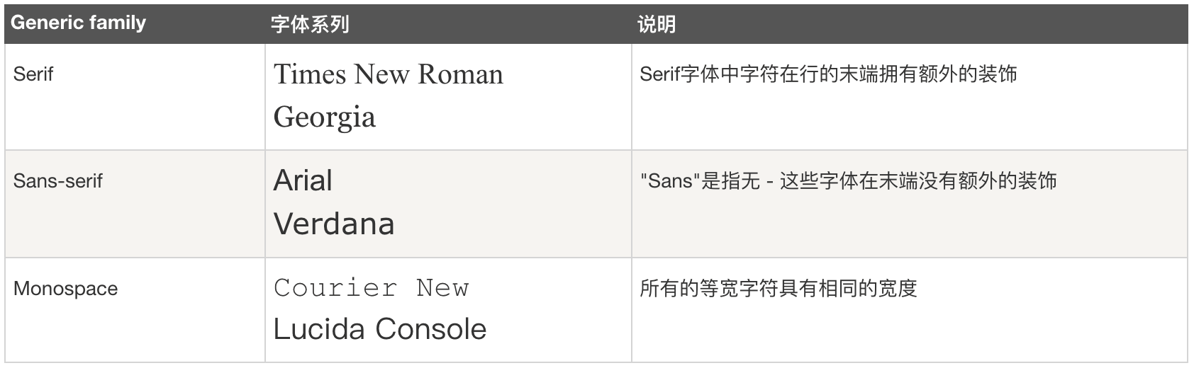
- 具体代码
Element {
  font-family: 'Times New Roman', Georgin;
  font-family: Arial, Verdana;
  font-family: 'Courier New', 'Lucida Console';
}
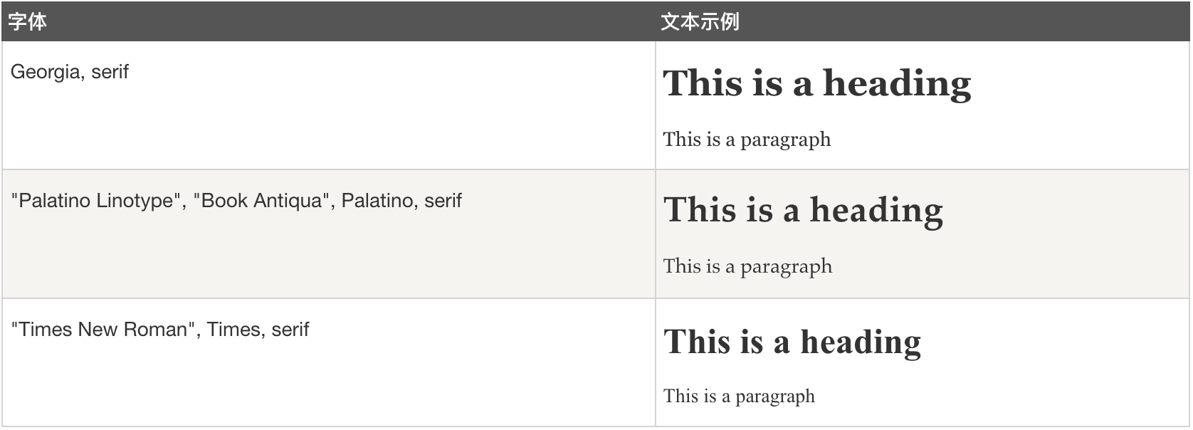
Serif 字体
Element {
  font-family: Georgia, serif;
  font-family: "Palatino Linotype", "Book Antiqua", Palatino, serif;
  font-family: "Times New Roman", Times, serif;
}
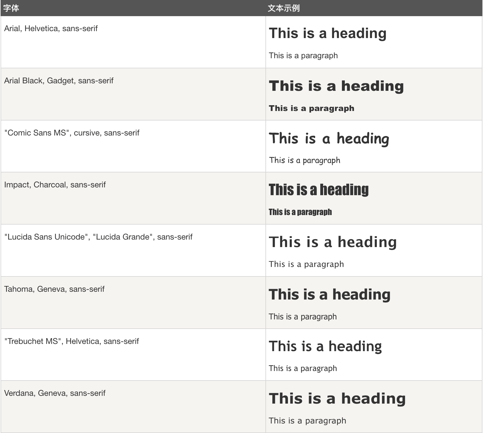
sans - serif字体
Element {
  font-family: Arial, Helvetica, sans-serif;
  font-family: Arial Black, Gadget, sans-serif;
  font-family: "Comic Sans MS", cursive, sans-serif;
  font-family: Impact, Charcoal, sans-serif;
  font-family: "Lucida Sans Unicode", "Lucida Grande", sans-serif;
  font-family: Tahoma, Geneva, sans-serif;
  font-family: "Trebuchet MS", Helvetica, sans-serif;
  font-family: Verdana, Geneva, sans-serif;
}
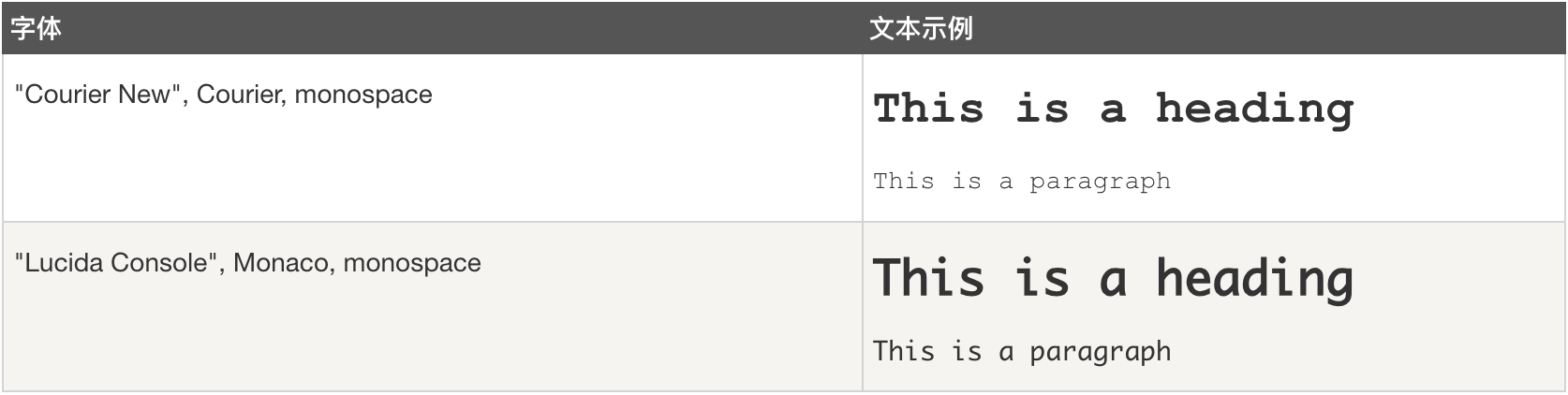
Monospace 字体
Element {
  font-family: "Courier New", Courier, monospace;
  font-family: "Lucida Console", Monaco, monospace;
}
@font-face
@font-face {
  font-family: myFirstFont;
  src: url(sansation_light.woff);


  // https://developer.mozilla.org/zh-CN/docs/Web/CSS/@font-face/font-display
  /** font-display 属性决定了一个 @font-face 在不同的下载时间和可用时间下是如何展示 */
  /** swap 用于告知浏览器使用该字体的文本应立即使用某种系统字体显示。自定义字体准备就绪后,即会替换系统字体。 */
  font-display: swap;
}
div {
  font-family:myFirstFont;
}

@font-face {
  font-family: 'iconfont';
  src: url('//at.alicdn.com/t/font_1671960_px9bj3xkv6r.eot');
  src: url('//at.alicdn.com/t/font_1671960_px9bj3xkv6r.eot?#iefix') format('embedded-opentype'),
  url('//at.alicdn.com/t/font_1671960_px9bj3xkv6r.woff2') format('woff2'),
  url('//at.alicdn.com/t/font_1671960_px9bj3xkv6r.woff') format('woff'),
  url('//at.alicdn.com/t/font_1671960_px9bj3xkv6r.ttf') format('truetype'),
  url('//at.alicdn.com/t/font_1671960_px9bj3xkv6r.svg#iconfont') format('svg');
}
.iconfont {
  font-family: "iconfont" !important;
  font-style: normal;
  -webkit-font-smoothing: antialiased;
  -webkit-text-stroke-width: .2px;
  -moz-osx-font-smoothing: grayscale;

  font-variant: small-caps;

  -webkit-text-size-adjust: 100%;
}


Element {
  font-family: Arial, Helvetica, sans-serif;
  font-family: Cambria, Cochin, Georgia, Times, 'Times New Roman', serif;
  /**
    宋体	SimSun
    黑体	SimHei
    微软雅黑	Microsoft YaHei
    微软正黑体	Microsoft JhengHei
    新宋体	NSimSun
    新细明体	PMingLiU
    细明体	MingLiU
    标楷体	DFKai-SB
    仿宋	FangSong
    楷体	KaiTi
    仿宋_GB2312	FangSong_GB2312
    楷体_GB2312	KaiTi_GB2312
   */

  /**
  * 文字平滑属性
  * -webkit-font-smoothing:none | antialiased | subpixel-antialiased;
  */
  -webkit-font-smoothing: none;  /*关闭抗锯齿,字体边缘犀利*/
  -webkit-font-smoothing: antialiased;  /*字体像素级平滑,在深色背景上会让文字看起来更细*/
  -webkit-font-smoothing: subpixel-antialiased;  /*字体亚像素级平滑,主要为了在非视网膜设备下更好的显示*/

  /**
  * 字距调整属性
  * font-kerning: auto | normal | none;
  */
  font-kerning: auto;  /**/
  font-kerning: normal;  /**/
  font-kerning: none;  /**/
}
- Google Fonts: 将 &display=swap 参数添加到 Google Fonts 网址的末尾
<link href="https://fonts.googleapis.com/css?family=Roboto:400,700&display=swap" rel="stylesheet"/>
字体(Font) 属性
文本字体
Element {
  -webkit-font-smoothing: antialiased;  /*默认值*/
  -webkit-font-smoothing: grayscale;  /*抗锯齿很好*/
  -webkit-font-smoothing: none;  /*对低像素的文本比较好*/
  -moz-osx-font-smoothing:

  // CSS属性控制替代字形的数字,级分,和序标记物的使用
  font-variant-numeric: normal;
  font-variant-numeric: ordinal;
  font-variant-numeric: slashed-zero;
  font-variant-numeric: lining-nums;         /* <numeric-figure-values> */
  font-variant-numeric: oldstyle-nums;       /* <numeric-figure-values> */
  font-variant-numeric: proportional-nums;   /* <numeric-spacing-values> */
  font-variant-numeric: tabular-nums;        /* 激活一组数字,其中的数字都是相同的大小,使他们可以像表中一样轻松对齐。 */
  font-variant-numeric: diagonal-fractions;  /* <numeric-fraction-values> */。
  font-variant-numeric: stacked-fractions;   /* <numeric-fraction-values> */
  font-variant-numeric: oldstyle-nums stacked-fractions;

  /* Global values */
  font-variant-numeric: inherit;
  font-variant-numeric: initial;
  font-variant-numeric: unset;
}
电脑字体
- Linux系统
> /usr/share/fonts
- MacOS系统
> /Library/Fonts
高级功能
aspect-ratio
拖拽操作
设置或检索一个元素可以被拖拽,而不它的内容
Element {
  -webkit-user-drag: auto;  /*使用默认的拖拽行为,这种情况只有图片和链接可以被拖拽*/
  -webkit-user-drag: element;  /*整个元素而非它的内容可拖拽*/
  -webkit-user-drag: none;  /*元素不能被拖动。在通过选中后可拖拽*/
}
will-change
will-change 为 web 开发者提供了一种告知浏览器该元素会有哪些变化的方法,这样浏览器可以在元素属性真正发生变化之前提前做好对应的优化准备工作。
Element {
  will-change: auto
  will-change: scroll-position
  will-change: contents
  will-change: transform        // Example of <custom-ident>
}
touch-action
touch-action 用于设置触摸屏用户如何操纵元素的区域 (例如,浏览器内置的缩放功能)。触摸动作也经常用于完全解决由支持双击缩放手势引起的点击事件的延迟。
Element {
  /* Keyword values */
  touch-action: auto;
  touch-action: none;
  touch-action: pan-x;
  touch-action: pan-left;
  touch-action: pan-right;
  touch-action: pan-y;
  touch-action: pan-up;
  touch-action: pan-down;
  touch-action: pinch-zoom;
  touch-action: manipulation;

  /* Global values */
  touch-action: inherit;
  touch-action: initial;
  touch-action: unset;
}
滚动条
滚动布局:scroll-layout

滚动区:scroll-view
滚动区容器:scroll-view-wrapper
滚动区内容:scroll-view-content

滚动条布局:scroll-bar-layout
滚动条容器:scroll-bar-wrapper
滚动条轨道:scroll-bar-track
滚动条滑块:scroll-bar-thumb
<!--滚动布局-->
<div class="own-scroll-layout">
  <!--滚动区布局-->
  <div class="own-scroll-view-layout">
    <!--滚动区容器-->
    <div class="com-flex own-scroll-view-wrapper">
      <!--滚动区内容-->
      <div class="com-flex own-scroll-view-content">

      </div>
    </div>
  </div>

  <div class="own-scroll-bar-layout">
    <!--滚动条容器-->
    <div class="own-scroll-bar-wrapper">
      <!--滚动条轨迹-->
      <div class="own-scroll-bar-track"></div>
      <!--滚动条滑块容器-->
      <div class="own-scroll-bar-thumb-wrapper">
        <!--滚动条滑块-->
        <div class="own-scroll-bar-thumb"></div>
      </div>
    </div>
  </div>
</div>
::-web kit-滚动条:滚动条
::-网络工具包-滚动条-按钮:滚动条上向上或向下的箭头
::-web kit-scroll bar-thumb:可以拖动的滚动手柄
::-web kit-scroll bar-track:进度条
::-web kit-scroll bar-track-piece:手柄未覆盖的区域
::-web kit-scroll bar-corner:滚动条的底角,垂直滚动条和水平滚动条在此交汇
::-webkit-resizer :出现在某些元素底角的可拖动的大小调整手柄
scrollbar-color CSS 属性
设置滚动条轨道(track)和滑块(thumb)的颜色。
- 轨道是指滚动条的背景,其一般是固定且与滚动位置无关的。
- 滑块是指滚动条的滑动部分,其通常浮动于轨道的顶部。
.scroller {
  width: 300px;
  height: 100px;
  overflow-y: scroll;
  scrollbar-color: #007 #bada55;
}
.com-scroll-y {
  overflow-y: auto !important;
  -webkit-overflow-scrolling: touch !important;


  /* Firefox */
  scrollbar-width: thin;
  scrollbar-color: #4CAF50 #e0e0e0;
}
.com-scroll-y:not(.com-frame) {
  overflow: hidden;
  width: 100%;
  height: 100%;
}

Element {
  /** 平滑滚动 */
  scroll-behavior: smooth;
}

.com-scroll {
  overflow-y: auto !important;
  -webkit-overflow-scrolling: touch !important;
}
.com-scroll:not(.com-scroll-y) {
  overflow: hidden;
}
优化滚动机制
Element {
  /**
   * 优化滚动机制
   * scroll-snap-type: none | [ x | y | block | inline | both ] [ mandatory | proximity ]
   * scroll-snap-align: start | center | end;
   */
  scroll-snap-type: x mandatory;
  scroll-snap-align: center;
}
滚动条样式
.aux-bar {
  -ms-overflow-style: none;
  overflow: -moz-scrollbars-none;
}

/** 隐藏滚动条 */
.aux-bar::-webkit-scrollbar {
  display: none;  /** chrome safari */
}
.aux-bar {
  scrollbar-width: none; /** firefox */
  -ms-overflow-style: none; /** IE 10+ */
}


/* 全局样式 */
::-webkit-scrollbar {
  width: 8px; /* 设置滚动条宽度 */

  border-radius: 4px;
}

/* 水平滚动条样式 */
::-webkit-scrollbar-track {
  background-color: #f5f5f5; /* 设置滑道背景色 */
}

::-webkit-scrollbar-thumb {
  background-color: #aaa; /* 设置滑块背景色 */
  border-radius: 4px; /* 设置滑块圆角 */
}


/* Firefox浏览器支持 */
@supports (-moz-appearance:none) {
  ::-moz-scrollbar {
    width: 8px; /* 设置滚动条宽度 */
  }

  ::-moz-scrollbar-track {
    background-color: #f5f5f5; /* 设置滑道背景色 */
  }

  ::-moz-scrollbar-thumb {
    background-color: #aaa; /* 设置滑块背景色 */
    border-radius: 4px; /* 设置滑块圆角 */
  }
}
flex容器实现滚动条
<style type="text/css">
  .other {
    position: relative;
    margin-top: 100px;
    margin-left: 100px;
    width: 800px;
    height: 300px;
    border: 10px solid #f00;
  }
</style>

<style type="text/css">
  .own-scroll-layout {
    position: relative;
    width: 100%;
    height: 100%;
    overflow: hidden;
  }
  .own-scroll-wrapper {
    position: relative;
    width: 100%;
    height: 100%;
    overflow-y: hidden;
    overflow-x: auto;
  }
  /** 隐藏滚动条 */
  .own-scroll-wrapper::-webkit-scrollbar {
    display: none; /** chrome safari */
  }
  .own-scroll-wrapper {
    scrollbar-width: none; /** firefox */
    -ms-overflow-style: none; /** IE 10+ */
  }
  .own-scroll-content {
    position: relative;
    height: 100%;
    flex-wrap: nowrap;
    -webkit-flex-wrap: nowrap;
  }
  .own-scroll-layer {
    position: relative;
    height: 100%;
    flex-shrink: 0;
    flex-grow: 0;
  }
</style>


<div class="other">
  <div class="own-scroll-layout">
    <div class="own-scroll-wrapper">
      <div class="com-flex own-scroll-content">
        <div class="com-flex own-scroll-layer">
          <div style="width: 300px; background-color: #0f0">111</div>
          <div style="width: 300px; background-color: #00f">111</div>
          <div style="width: 300px; background-color: #000">111</div>
          <div style="width: 300px; background-color: #0f0">111</div>
          <div style="width: 300px; background-color: #f00">111</div>
        </div>
      </div>
    </div>
  </div>
</div>
filter(滤镜) 属性
/**
 * 滤镜
 * 示例:https://www.runoob.com/cssref/css3-pr-filter.html
 * IE系列不支持
 *
 */
img {
  -webkit-filter: grayscale(100%); /* Chrome, Safari, Opera */
  filter: grayscale(100%);
}


/**
 *
Filter 函数
注意: 滤镜通常使用百分比 (如:75%), 当然也可以使用小数来表示 (如:0.75)。

Filter	描述
none	默认值,没有效果。
blur(px)	给图像设置高斯模糊。"radius"一值设定高斯函数的标准差,或者是屏幕上以多少像素融在一起, 所以值越大越模糊;如果没有设定值,则默认是0;这个参数可设置css长度值,但不接受百分比值。
brightness(%)	给图片应用一种线性乘法,使其看起来更亮或更暗。如果值是0%,图像会全黑。值是100%,则图像无变化。其他的值对应线性乘数效果。值超过100%也是可以的,图像会比原来更亮。如果没有设定值,默认是1。
contrast(%)	调整图像的对比度。值是0%的话,图像会全黑。值是100%,图像不变。值可以超过100%,意味着会运用更低的对比。若没有设置值,默认是1。
drop-shadow(h-shadow v-shadow blur spread color)
给图像设置一个阴影效果。阴影是合成在图像下面,可以有模糊度的,可以以特定颜色画出的遮罩图的偏移版本。 函数接受<shadow>(在CSS3背景中定义)类型的值,除了"inset"关键字是不允许的。该函数与已有的box-shadow box-shadow属性很相似;不同之处在于,通过滤镜,一些浏览器为了更好的性能会提供硬件加速。<shadow>参数如下:

<offset-x> <offset-y> (必须)
这是设置阴影偏移量的两个 <length>值. <offset-x> 设定水平方向距离. 负值会使阴影出现在元素左边. <offset-y>设定垂直距离.负值会使阴影出现在元素上方。查看<length>可能的单位.
如果两个值都是0, 则阴影出现在元素正后面 (如果设置了 <blur-radius> and/or <spread-radius>,会有模糊效果).
<blur-radius> (可选)
这是第三个code><length>值. 值越大,越模糊,则阴影会变得更大更淡.不允许负值 若未设定,默认是0 (则阴影的边界很锐利).
<spread-radius> (可选)
这是第四个 <length>值. 正值会使阴影扩张和变大,负值会是阴影缩小.若未设定,默认是0 (阴影会与元素一样大小).
注意: Webkit, 以及一些其他浏览器 不支持第四个长度,如果加了也不会渲染。

<color> (可选)
查看 <color>该值可能的关键字和标记。若未设定,颜色值基于浏览器。在Gecko (Firefox), Presto (Opera)和Trident (Internet Explorer)中, 会应用colorcolor属性的值。另外, 如果颜色值省略,WebKit中阴影是透明的。
grayscale(%)
将图像转换为灰度图像。值定义转换的比例。值为100%则完全转为灰度图像,值为0%图像无变化。值在0%到100%之间,则是效果的线性乘子。若未设置,值默认是0;

hue-rotate(deg)
给图像应用色相旋转。"angle"一值设定图像会被调整的色环角度值。值为0deg,则图像无变化。若值未设置,默认值是0deg。该值虽然没有最大值,超过360deg的值相当于又绕一圈。

invert(%)
反转输入图像。值定义转换的比例。100%的价值是完全反转。值为0%则图像无变化。值在0%和100%之间,则是效果的线性乘子。 若值未设置,值默认是0。

opacity(%)
转化图像的透明程度。值定义转换的比例。值为0%则是完全透明,值为100%则图像无变化。值在0%和100%之间,则是效果的线性乘子,也相当于图像样本乘以数量。 若值未设置,值默认是1。该函数与已有的opacity属性很相似,不同之处在于通过filter,一些浏览器为了提升性能会提供硬件加速。

saturate(%)
转换图像饱和度。值定义转换的比例。值为0%则是完全不饱和,值为100%则图像无变化。其他值,则是效果的线性乘子。超过100%的值是允许的,则有更高的饱和度。 若值未设置,值默认是1。

sepia(%)
将图像转换为深褐色。值定义转换的比例。值为100%则完全是深褐色的,值为0%图像无变化。值在0%到100%之间,则是效果的线性乘子。若未设置,值默认是0;

url()
URL函数接受一个XML文件,该文件设置了 一个SVG滤镜,且可以包含一个锚点来指定一个具体的滤镜元素。

例如:

filter: url(svg-url#element-id)


 *
 */
mask-image
设置了用作元素蒙版层的图像。
代码示例
{
  /** 示例,但无效 */
  mask-image: linear-gradient(to right, black 0, black 40px,black calc(40px + 16px),black calc(100% - (40px + 16px)), transparent calc(100% - 40px), transparent 100%);
  mask-image: linear-gradient(to right, transparent 0, transparent 40px,black calc(40px + 16px),black calc(100% - (40px + 16px)), black calc(100% - 40px), black 100%);


}
LESS 动态CSS语言
Less (Leaner Style Sheets 的缩写) 是一门向后兼容的 CSS 扩展语言。
安装配置
- 安装:pnpm i less --save-dev
- 编译
> lessc styles.less styles.css
注意事项
- @use从 Dart Sass 1.80.0 开始被弃用。
自动迁移
npm install -g sass-migrator

cd /your-project


# 迁移单个文件
sass-migrator module --migrate-deps src/styles/main.scss

# 迁移整个目录
sass-migrator module --migrate-deps src/**/*.scss
模块系统
@use
@forward
代码示例
@width: 10px;
@height: @width + 10px;

Element {
  .bordered {
    border: dotted 1px black;
  }

  width: @width;
  height: @height;

  .bordered();

  @media (min-width: 768px) {
    @media  (min-resolution: 192dpi) {
      background-color: #f00;
    }
  }

  @base: 2cm * 3mm;
  @color: #224488 / 2;

}
基础语法
/* 导入(Importing) */
@use "library";  /*library.less*/
@use "typo.css";

/* 变量(Variables) */
@width: 10px;
@height: @width + 10px;

/* 混合(Mixins) */
.bordered {
  border-top: dotted 1px black;
  border-bottom: solid 2px black;
}

/* 嵌套(Nesting) */

/* @规则嵌套和冒泡 */

/* 运算(Operations) */
@var: 50vh/2;
{
  width: calc(50% + (@var - 20px));  // 结果是 calc(50% + (25vh - 20px))
}

/* calc() 特例 */

/* 转义(Escaping) */
@min768: (min-width: 768px);

/* 函数(Functions)内置了多种函数用于转换颜色、处理字符串、算术运算等 */

/* 命名空间和访问符 */

/* 映射(Maps) */

/* 作用域(Scope) */

/* 注释(Comments) */

Element {
  width: @width;
  height: @height;
  .bordered();

  @media @min768 {
    font-size: 1.2rem;
  }
}
深度作用选择器
.a /deep/ .b {

}
JS 和 SCSS 之间共享变量
SASS 动态CSS语言
SASS (Syntactically Awesome StyleSheets 的缩写)是一款强化 CSS 的辅助工具,它在 CSS 语法的基础上增加了变量 (variables)、嵌套 (nested rules)、混合 (mixins)、导入 (inline imports) 等高级功能,这些拓展令 CSS 更加强大与优雅。使用 Sass 以及 Sass 的样式库(如 Compass)有助于更好地组织管理样式文件,以及更高效地开发项目。
安装配置
- 安装Ruby:sass基于Ruby语言开发而成,因此安装sass前需要安装Ruby。
- 安装sass:gem install sass
- 安装compass:gem install compass
模块系统
@use
- 使用@use替换@use
@use "@/styles/variables.scss" as *;
- base.scss
$primary-color: #333;

Element {
  color: $primary-color;
}
- index.scss
@use 'base';

Element {
  background-color: base.$primary-color;
}
变量
Element {
  $fontsize: 16px;

  font-size: $fontsize;
}
嵌套
Element {
  $fontsize: 16px;

  > Element {
    font-size: $fontsize;
  }
}
混合
Stylus 动态CSS语言
官网:https://stylus-lang.com/ GitHub:https://github.com/stylus/stylus/
PostCSS
PostCSS是一个用 JavaScript 工具和插件转换 CSS 代码的工具。
性能优化
will-change:提前标注该元素使用动画,浏览器会自动识别。
浏览器兼容方案
HACK方案
先判断用户用的哪个 IE 版本,然后在标签上加上该版本的 class,这样可以方便 hack,这是目前最好的 hack 方式之一。
<!—[if IE 6 ]><html class="ie ielt9 ielt8 ielt7 ie6" lang="en-US"><![endif]—>
<!—[if IE 7 ]><html class="ie ielt9 ielt8 ie7" lang="en-US"><![endif]—>
<!—[if IE 8 ]><html class="ie ielt9 ie8" lang="en-US"><![endif]—>
<!—[if IE 9 ]><html class="ie ie9" lang="en-US"><![endif]—>
<!—[if (gt IE 9)|!(IE)]><!—><html lang="en-US"><!—<![endif]—>

<style type="text/css">
  .ie6 xxx {};
  .ie7 xxx {};
</style>
常用功能案例
清除浮动
# 方式一:overflow: hidden;
<body data-url="https://test.ysunlight.com">
  <div style="float:left;width:100px;height:100px;background-color: #666;"></div>
  <section style="width:100px;height:100px;background-color:#f00;overflow: hidden;"></section>
</body>

# 方式二:clear: both;
<body data-url="https://test.ysunlight.com">
  <div style="float:left;width:100px;height:100px;background-color: #666;"></div>
  <section style="width:100px;height:100px;background-color:#f00;clear: both;"></section>
</body>
移动端1px兼容性处理
一.在ios8+中当devicePixelRatio=2的时候使用0.5px p { border:1px solid #000; } @media (-webkit-min-device-pixel-ratio: 2) { p { border:0.5px solid #000; } }
二,伪类 + transform 实现
对于老项目伪类+transform是比较完美的方法了。
原理是把原先元素的 border 去掉,然后利用 :before 或者 :after 重做 border ,并 transform 的 scale 缩小一半,原先的元素相对定位,新做的 border 绝对定位。
单条border样式设置:
.scale-1px{ position: relative; border:none; }

.scale-1px:after {
    content: '';
    position: absolute; bottom: 0;
    background: #000;
    width: 100%; height: 1px;
    -webkit-transform: scaleY(0.5);
    transform: scaleY(0.5);
     -webkit-transform-origin: 0 0;
    transform-origin: 0 0;
}
三,viewport + rem 实现
这种兼容方案相对比较完美,适合新的项目,老的项目修改成本过大。
在devicePixelRatio = 2 时,输出viewport:
在devicePixelRatio = 3 时,输出viewport:
优点:所有场景都能满足,一套代码,可以兼容基本所有布局
缺点:老项目修改代价过大,只适用于新项目
四,使用box-shadow模拟边框
利用css 对阴影处理的方式实现0.5px的效果
样式设置:
.box-shadow-1px {
box-shadow: inset 0px -1px 1px -1px #c8c7cc;
}
优点:代码量少,可以满足所有场景
缺点:边框有阴影,颜色变浅
左右两栏布局7种实现方案
# 实现一:
<div style='width:600px;border: 1px solid #f00; position: relative;'>
  <div style='width:200px; height: 50px; float: left;'>目录</div>
  <div style='height: 50px; background: #ccc;overflow: hidden;'>内容(实现两栏自适应布局,方法一)</div>
</div>

# 实现二:
<div style='border: 1px solid #f00; position: relative; clear: left;'>
  <div style='float: left;z-index:1;width: 200px; height: 50px;background-color: #00f;'>目录</div>
  <div style='height: 50px; background: #ccc; position: relative;'>内容(实现两栏自适应布局,方法二)</div>
</div>

# 实现三:flex
<div style='border: 1px solid #f00; position: relative; display: flex;'>
  <div style='width: 200px; height: 50px;'>目录</div>
  <div style='height: 50px; background: #ccc; flex: 1;'>内容(实现两栏自适应布局,方法三)</div>
</div>

# 实现四:calc(100% - 200px)
<div style='border: 1px solid #f00; position: relative; margin-bottom: 20px; overflow: hidden;'>
  <div style='width: 200px; height: 50px; position: relative;'>目录</div>
  <div style='width: 100%; height: 50px; background: #ccc; position: absolute; top: 0; margin-left:200px; width: -webkit-calc(100% - 200px);'>内容(实现两栏自适应布局,方法四)</div>
</div>

# 实现五:
<div style='border: 1px solid #f00; position: relative; overflow: hidden; margin-bottom: 20px;'>
  <div style='width: 200px; height: 50px; float: left;'>目录</div>
  <div style='height: 50px; background: #ccc; float: left; width: -webkit-calc(100% - 200px);'>内容(实现两栏自适应布局,方法二)</div>
</div>
canvas左侧导航栏切换特效
/**
 * CSS
 * transition: transform .25s ease-in-out, opacity .25s ease-in-out
 */

function setNavSlide(index: number) {
  this.nav.slide = `;transform: translate3d(0, ${index * 70}px, 0);-webkit-transform: translate3d(0, ${index * 70}px, 0);transition-duration:200ms;-webkit-transition-duration:200ms;`;
}

function selectTem(index: number) {
  const list = [...this.nav.list];

  switch(index) {
    case 0:
      list.forEach((key: any) => {
        const item = key;
        let x = 40;
        item.template.style = `opacity:0;z-index:0;transform: translate3d(0, ${x}px, 0);-webkit-transform: translate3d(0, ${x}px, 0);`;
      });
      let y = 0;
      list[index].template.style = `opacity:1;z-index:1;transform: translate3d(0, ${y}px, 0);-webkit-transform: translate3d(0, ${y}px, 0);`;
      break;
    default:
      for (let j = 0; j < index; j += 1) {
        const y = -40;
        list[j].template.style = `opacity:0;z-index:0;transform: translate3d(0, ${y}px, 0);-webkit-transform: translate3d(0, ${y}px, 0);`;
      }
      let y = 0;
      list[index].template.style = `opacity:1;z-index:1;transform: translate3d(0, ${y}px, 0);-webkit-transform: translate3d(0, ${y}px, 0);`;
      const length = list.length;
      if (index < length) {
        for (let j = (index + 1); j < length; j += 1) {
          let x = 40;
          list[j].template.style = `opacity:0;z-index:0;transform: translate3d(0, ${x}px, 0);-webkit-transform: translate3d(0, ${x}px, 0);`;
        }
      }
  }
}
经典模块案例
Loading加载
经典旋转圆圈一
<style type="text/css">
.com-loading {
  overflow: hidden;
  position: relative;
}
.com-loading-basic {
  position: relative;
  width: 20px;
  height: 20px;
  border: 2px solid transparent;
  border-top-color: #f00;
  border-radius: 100%;
  animation: comLoadingBasic infinite 800ms linear;
  -webkit-animation: comLoadingBasic infinite 800ms linear;
}
@keyframes comLoadingBasic {
  0% {
    transform: rotate(0);
    -webkit-transform: rotate(0);
    -ms-transform: rotate(0);
    -moz-transform: rotate(0);
    -o-transform: rotate(0);
  }
  100% {
    transform: rotate(360deg);
    -webkit-transform: rotate(360deg);
    -ms-transform: rotate(360deg);
    -moz-transform: rotate(360deg);
    -o-transform: rotate(360deg);
  }
}
</style>

<div class="com-loading">
  <div class="com-loading-basic"></div>
</div>
经典旋转圆圈二
<style type="text/css">
  .loading-1 {
    width: 40px;
    height: 40px;
    border: 4px solid #e0e0e0;
    border-top-color: #4285f4;
    border-radius: 50%;
    animation: spin 1s linear infinite;
  }
  @keyframes spin {
    0% { transform: rotate(0deg); }
    100% { transform: rotate(360deg); }
  }
</style>

<div class="loading-1"></div>
双圆圈旋转
<style type="text/css">
  .loading-2 {
    position: relative;
    width: 40px;
    height: 40px;
  }
  .loading-2::before, .loading-2::after {
    content: '';
    position: absolute;
    border: 4px solid transparent;
    border-radius: 50%;
  }
  .loading-2::before {
    width: 40px;
    height: 40px;
    border-top-color: #ea4335;
    animation: spin 1s linear infinite;
  }
  .loading-2::after {
    width: 20px;
    height: 20px;
    top: 10px;
    left: 10px;
    border-top-color: #fbbc05;
    animation: spin 0.8s reverse linear infinite;
  }
  @keyframes spin {
    0% { transform: rotate(0deg); }
    100% { transform: rotate(360deg); }
  }
</style>

<div class="loading-2"></div>
跳动的圆点(三点加载)
<style type="text/css">
  .loading-3 {
    display: flex;
    gap: 6px;
  }
  .loading-3 .dot {
    width: 12px;
    height: 12px;
    background: #34a853;
    border-radius: 50%;
    animation: bounce 1.2s ease-in-out infinite;
  }
  .loading-3 .dot:nth-child(2) {
    animation-delay: 0.2s;
  }
  .loading-3 .dot:nth-child(3) {
    animation-delay: 0.4s;
  }
  @keyframes bounce {
    0%, 100% { transform: translateY(0); }
    50% { transform: translateY(-15px); }
  }
</style>

<div class="loading-3">
  <div class="dot"></div>
  <div class="dot"></div>
  <div class="dot"></div>
</div>
进度条加载
<style type="text/css">
  .loading-4 {
    width: 120px;
    height: 8px;
    background: #e0e0e0;
    border-radius: 4px;
    overflow: hidden;
  }
  .loading-4 .bar {
    width: 40%;
    height: 100%;
    background: #4285f4;
    border-radius: 4px;
    animation: progress 1.5s ease-in-out infinite;
  }
  @keyframes progress {
    0% { transform: translateX(-100%); }
    100% { transform: translateX(200%); }
  }
</style>

<div class="loading-4">
  <div class="bar"></div>
</div>
方形网格旋转
<style type="text/css">
  .loading-5 {
    position: relative;
    width: 40px;
    display: grid;
    grid-template-columns: repeat(2, 15px);
    gap: 6px;
    animation: grid-spin 3s linear infinite;
  }
  .loading-5 .square {
    width: 15px;
    height: 15px;
    background: #ea4335;
    border-radius: 2px;
  }
  .loading-5 .square:nth-child(even) {
    background: #fbbc05;
  }
  @keyframes grid-spin {
    0% { transform: rotate(0deg); }
    100% { transform: rotate(360deg); }
  }
</style>

<div class="loading-5">
  <div class="square"></div>
  <div class="square"></div>
  <div class="square"></div>
  <div class="square"></div>
</div>
脉冲圆点
<style type="text/css">
  .loading-6 {
    width: 30px;
    height: 30px;
    background: #34a853;
    border-radius: 50%;
    animation: pulse 1.5s ease-in-out infinite;
  }
  @keyframes pulse {
    0% { transform: scale(0.8); opacity: 0.8; }
    50% { transform: scale(1.2); opacity: 1; }
    100% { transform: scale(0.8); opacity: 0.8; }
  }
</style>

<div class="loading-6"></div>
旋转的线条
<style type="text/css">
  .loading-7 {
    position: relative;
    width: 40px;
    height: 40px;
  }
  .loading-7 .line {
    position: absolute;
    top: 50%;
    left: 50%;
    width: 30px;
    height: 2px;
    background: #4285f4;
    transform-origin: left center;
    animation: line-rotate 1.2s linear infinite;
  }
  .loading-7 .line::after {
    content: '';
    position: absolute;
    right: 0;
    width: 8px;
    height: 8px;
    background: #4285f4;
    border-radius: 50%;
  }
  @keyframes line-rotate {
    0% { transform: rotate(0deg); }
    100% { transform: rotate(360deg); }
  }
</style>

<div class="loading-7">
  <div class="line"></div>
</div>
弹跳的方块
<style type="text/css">
  .loading-8 {
    display: flex;
    gap: 4px;
  }
  .loading-8 .cube {
    width: 15px;
    height: 15px;
    background: #ea4335;
    animation: cube-bounce 1s ease-in-out infinite;
  }
  .loading-8 .cube:nth-child(1) { animation-delay: 0s; }
  .loading-8 .cube:nth-child(2) { animation-delay: 0.1s; }
  .loading-8 .cube:nth-child(3) { animation-delay: 0.2s; }
  .loading-8 .cube:nth-child(4) { animation-delay: 0.3s; }
  .loading-8 .cube:nth-child(5) { animation-delay: 0.4s; }
  @keyframes cube-bounce {
    0%, 100% { transform: translateY(0); }
    50% { transform: translateY(-20px); }
  }
</style>

<div class="loading-8">
  <div class="cube"></div>
  <div class="cube"></div>
  <div class="cube"></div>
  <div class="cube"></div>
  <div class="cube"></div>
</div>
波浪效果
<style type="text/css">
  .loading-9 {
    display: flex;
    gap: 2px;
    align-items: flex-end;
    height: 40px;
  }
  .loading-9 .wave {
    width: 6px;
    background: #fbbc05;
    border-radius: 3px;
    animation: wave 1.2s ease-in-out infinite;
  }
  .loading-9 .wave:nth-child(1) { height: 10px; animation-delay: 0s; }
  .loading-9 .wave:nth-child(2) { height: 20px; animation-delay: 0.1s; }
  .loading-9 .wave:nth-child(3) { height: 30px; animation-delay: 0.2s; }
  .loading-9 .wave:nth-child(4) { height: 20px; animation-delay: 0.3s; }
  .loading-9 .wave:nth-child(5) { height: 10px; animation-delay: 0.4s; }
  @keyframes wave {
    0%, 100% { transform: scaleY(0.5); }
    50% { transform: scaleY(1); }
  }
</style>

<div class="loading-9">
  <div class="wave"></div>
  <div class="wave"></div>
  <div class="wave"></div>
  <div class="wave"></div>
  <div class="wave"></div>
</div>
旋转的齿轮
<style type="text/css">
  .loading-10 {
    position: relative;
    width: 40px;
    height: 40px;
    animation: spin 2s linear infinite;
  }
  .loading-10 .gear {
    position: absolute;
    width: 40px;
    height: 40px;
    border: 4px solid #34a853;
    border-radius: 50%;
  }
  .loading-10 .gear::before {
    content: '';
    position: absolute;
    width: 10px;
    height: 40px;
    background: #34a853;
    top: 0;
    left: 15px;
  }
  .loading-10 .gear::after {
    content: '';
    position: absolute;
    width: 40px;
    height: 10px;
    background: #34a853;
    top: 15px;
    left: 0;
  }
  @keyframes spin {
    0% { transform: rotate(0deg); }
    100% { transform: rotate(360deg); }
  }
</style>

<div class="loading-10">
  <div class="gear"></div>
</div>
呼吸效果圆圈
<style type="text/css">
  .loading-11 {
    width: 40px;
    height: 40px;
    background: #4285f4;
    border-radius: 50%;
    animation: breathe 2s ease-in-out infinite;
  }
  @keyframes breathe {
    0%, 100% { transform: scale(0.9); opacity: 0.7; }
    50% { transform: scale(1.1); opacity: 1; }
  }
</style>

<div class="loading-11"></div>
缩放的圆点
<style type="text/css">
  .loading-12 {
    position: relative;
    width: 40px;
    height: 40px;
  }
  .loading-12 .scale-dot {
    position: absolute;
    width: 10px;
    height: 10px;
    background: #ea4335;
    border-radius: 50%;
    animation: scale 1.5s ease-in-out infinite;
  }
  .loading-12 .scale-dot:nth-child(1) { top: 0; left: 50%; transform: translateX(-50%); }
  .loading-12 .scale-dot:nth-child(2) { top: 50%; right: 0; transform: translateY(-50%); animation-delay: 0.2s; }
  .loading-12 .scale-dot:nth-child(3) { bottom: 0; left: 50%; transform: translateX(-50%); animation-delay: 0.4s; }
  .loading-12 .scale-dot:nth-child(4) { top: 50%; left: 0; transform: translateY(-50%); animation-delay: 0.6s; }
  @keyframes scale {
    0%, 100% { transform: scale(1); opacity: 1; }
    50% { transform: scale(2); opacity: 0.5; }
  }
</style>

<div class="loading-12">
  <div class="scale-dot"></div>
  <div class="scale-dot"></div>
  <div class="scale-dot"></div>
  <div class="scale-dot"></div>
</div>